This project involves designing a password-protected interface for searching an inventory of of durable baby equipment for community members in need. Managed by Vermont Connector founder Wendy Rice, the Baby Equipment Exchange inventory of items comes from individual donors and referral partners. As interest grew in the Exchange, the existing system was not able to scale with the growth, as it had become too inefficient. Also, the existing security measures are insufficient for many mutual aid partners’ needs.
What would a successful outcome for the project look like for you?
Resources obtained:
Project marketing materials
Competitor Analysis
By conducting a competitor analysis for the Baby Equipment Exchange, I analyzed features of competitor websites with similar products. Competitors analyzed:
Facebook Marketplace
Front Porch Forum
Seven Days Classifieds
Features analyzed (including essential functions of the project) included:
Inventory browsing
Inventory search
Item submission form
Password protection
MoSCoW Matrix
After compiling features from the above competitor and comparator sites, we organized them by priority using MoSCow matrices, pictured here.
The name of this tool is an acronym whose capitalized letters refer to the categories where the features are placed in the matrix, denoting their priority whether to include in the design:
Must have
Should have
Could have
Won’t have
Determining where each feature goes in the matrix depends on how necessary that feature is to be included in order for the final product to achieve its goal. In other words, whether the feature is vital for this product to carry out its primary function for users.
Problem Statement
I combined two problem statements in one for this project. I identified two primary user groups with different needs for this product.
To accommodate growing inventory as interest grows:
Social service and mutual aid workers need a secure mobile-friendly interface to access available baby equipment during client visits and to schedule equipment pickups.
Donors need a streamlined interface to upload equipment information and schedule donations.
Why Statement
The why statement summarizes why both user groups want to engage with this particular product.
To close the loop between saving still-usable baby equipment from waste and helping community families in need.
Task Flows
Task flow legend.
To illustrate how the client’s current workflow looks, I created task flows to identify which steps work well and which don’t.
The legend gives the key to interpreting the task flows below.
The teal and light teal are intended as the main colors, with tomato as an accent color. Black, gray, and white colors are also defined.
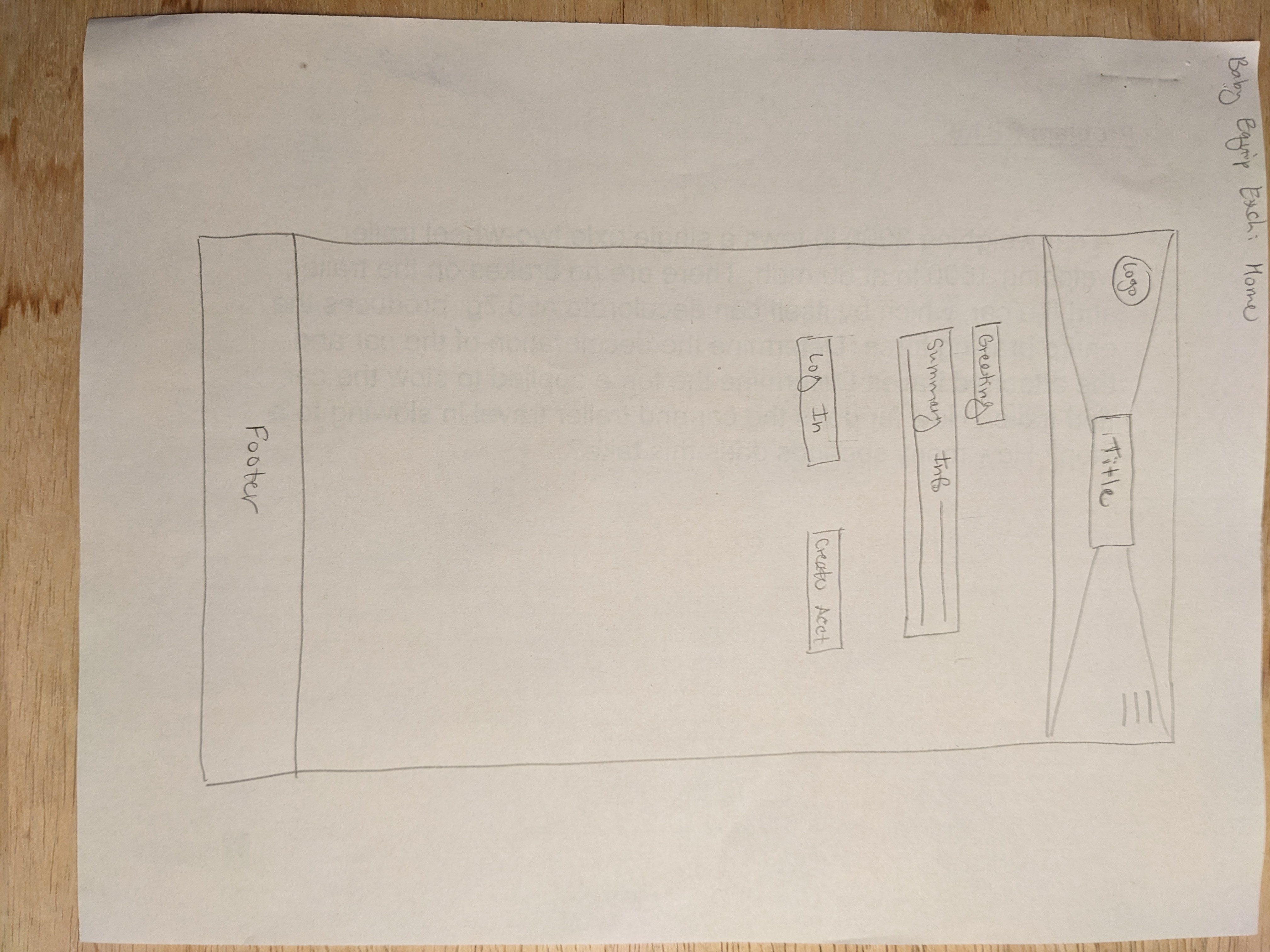
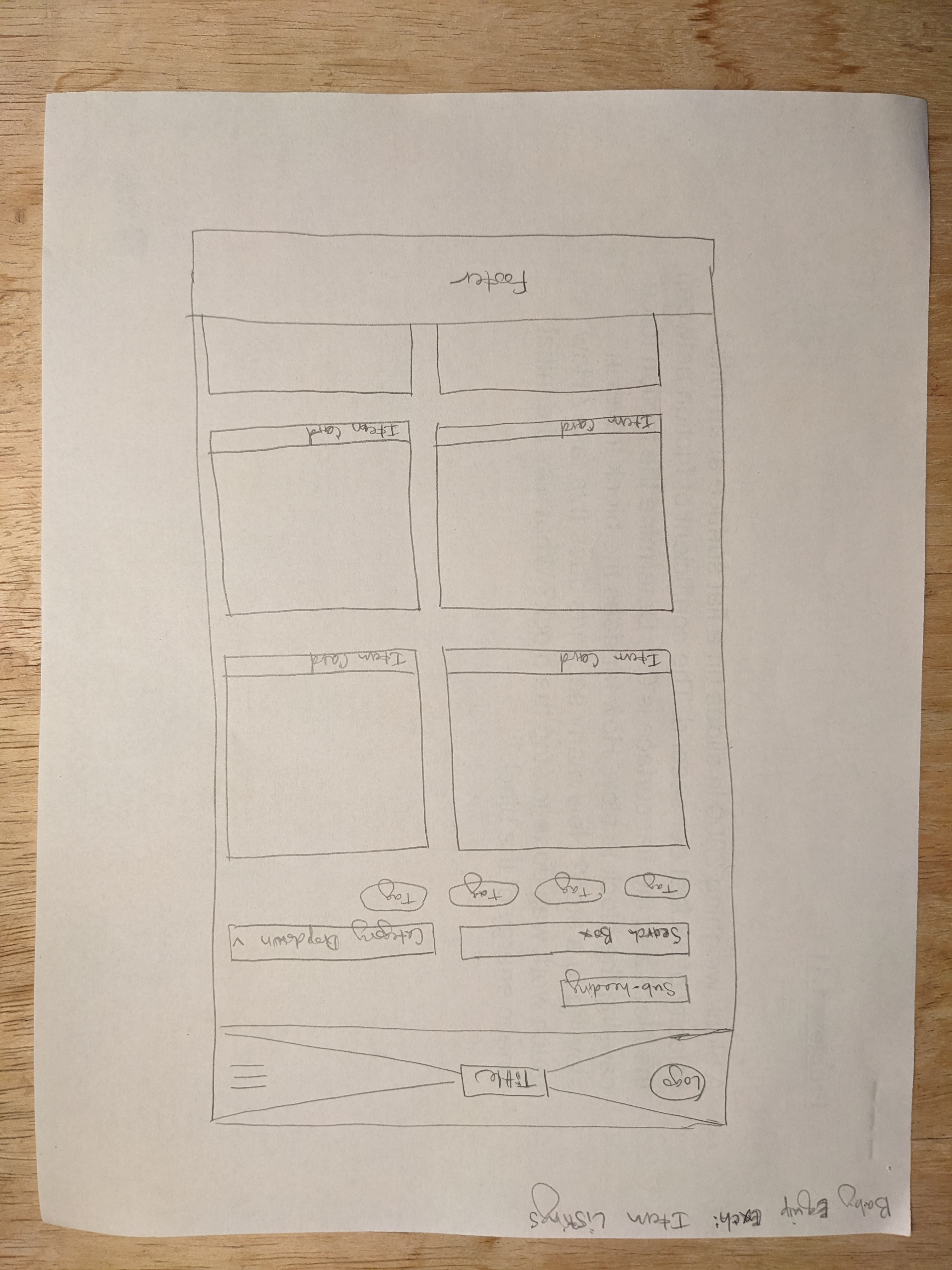
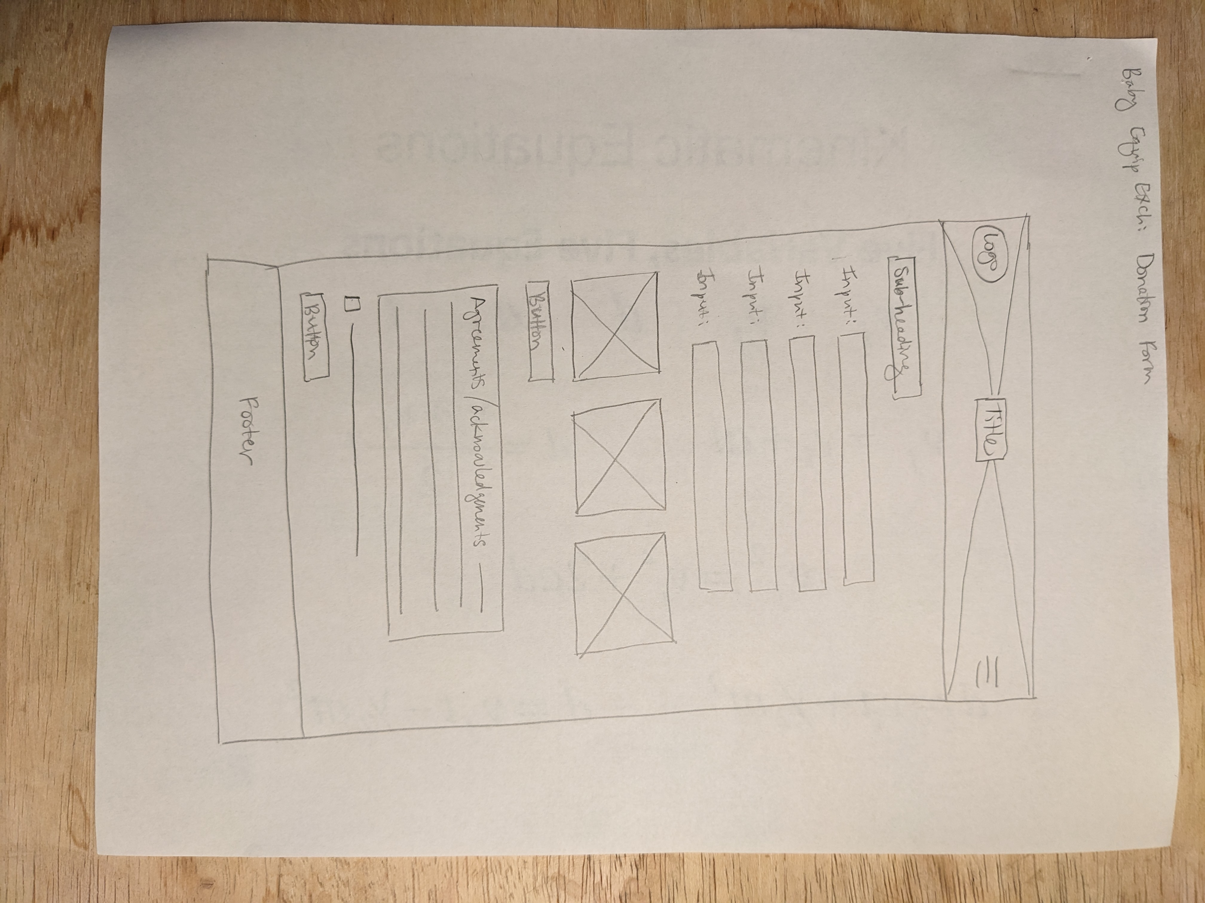
Sketching
Synthesizing the information from the previous steps, I used scrap paper to draw fast pencil sketches to get preliminary design ideas out on paper.
These pages may look similar in the final design, and they might not. Sketching helps me start translating my ideas and knowledge from words to visual solutions.
The Burlington, VT-based civic tech group Code for BTV provided infrastructure and resources for this project. As a result, I am creating a project information page for their website. The page design specifications are already defined for the website.


