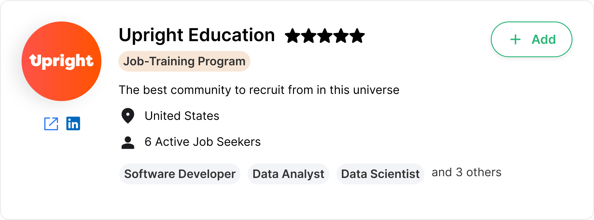
Has built-in job and placement data tracking for schools.
Gamifies job searching for job seekers.
Employer marketplace: recently launched prior to our project. Companies sign up and partner with schools and other talent communities where employers can access their job candidates.
Request
Two parts for the project, as suggested by the stakeholder:
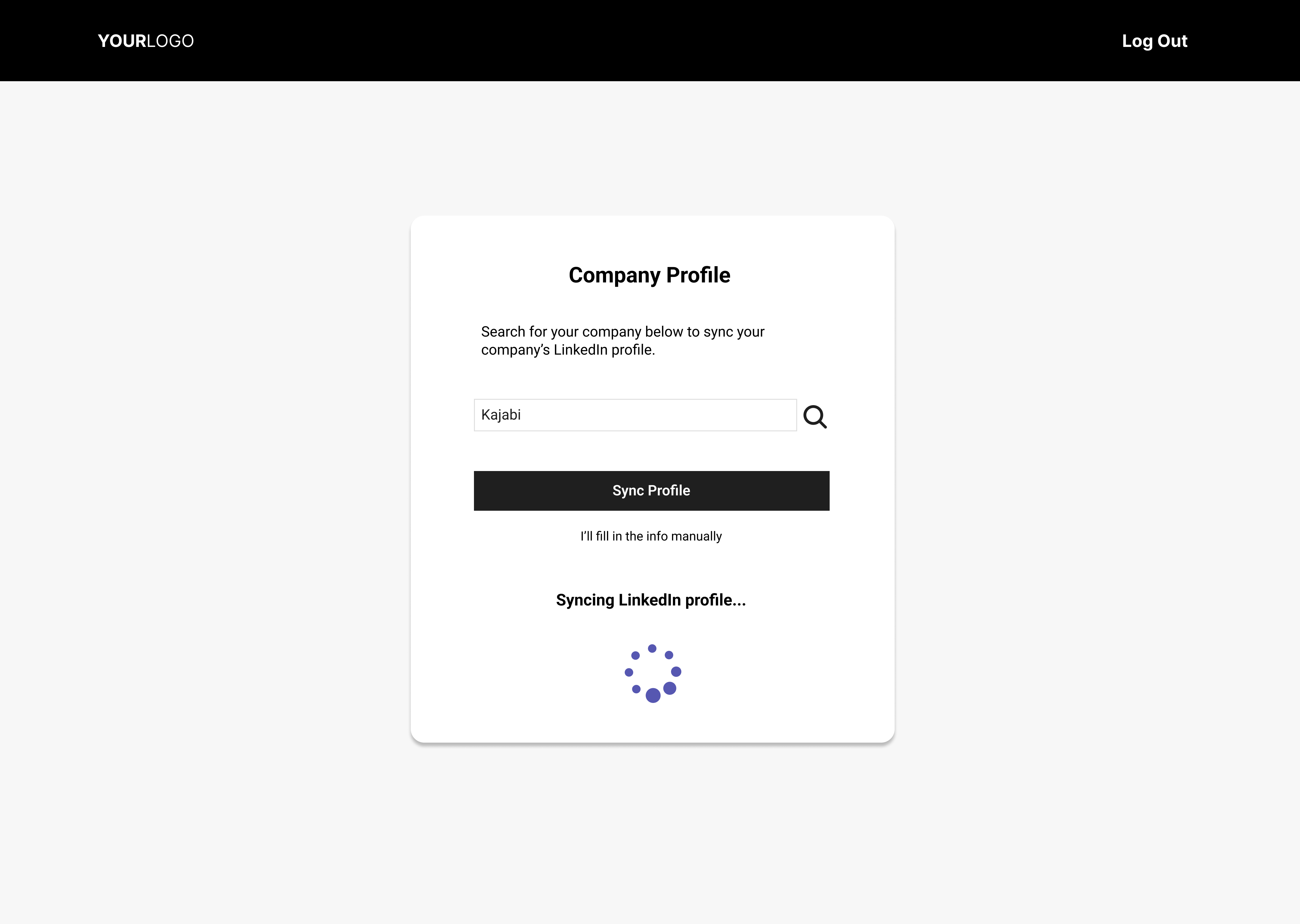
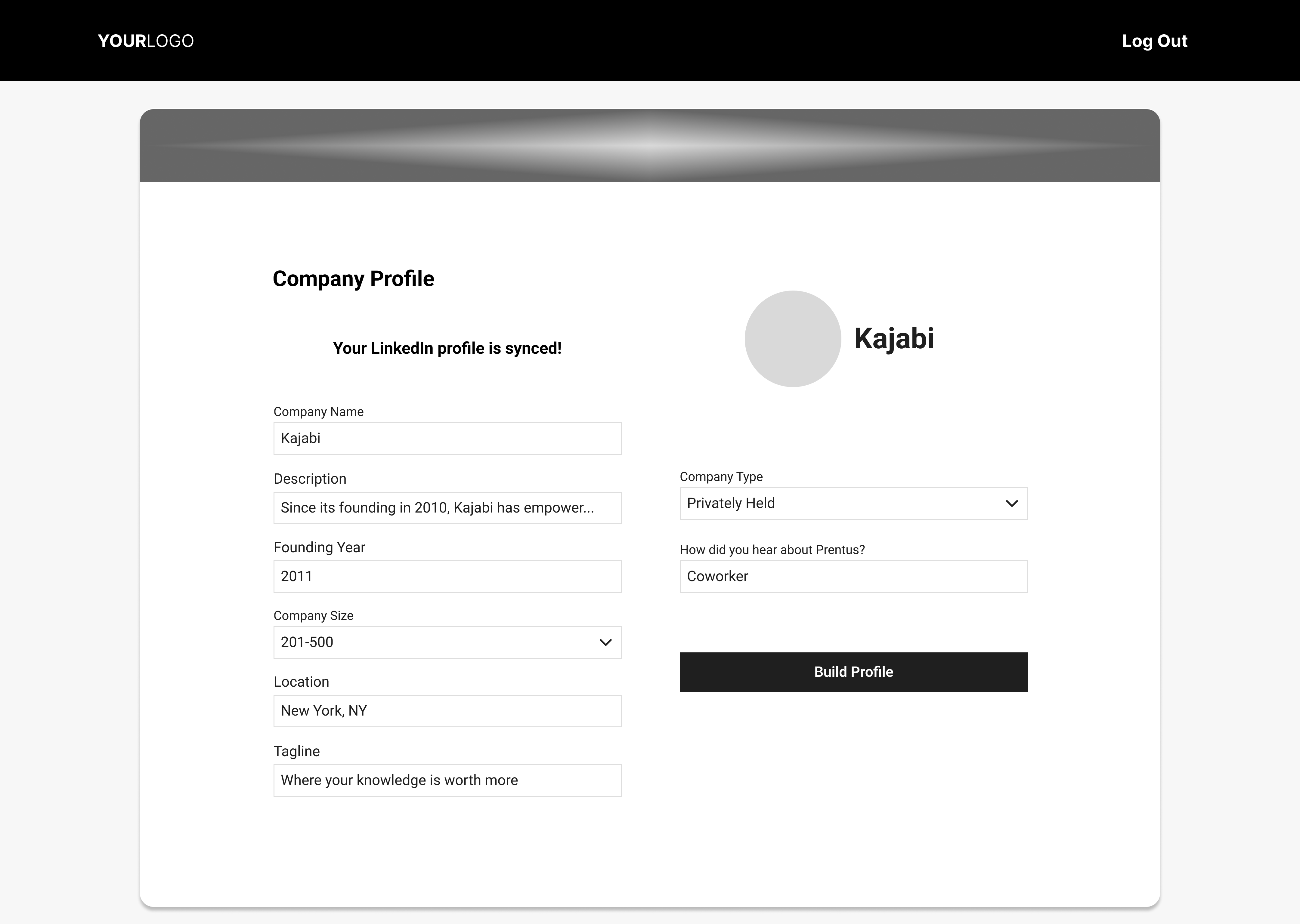
A re-imagined onboarding walk-through: Prentus reported their employer users would sign up for accounts and not know what to do next. They observed an opportunity to improve the existing employer onboarding process, with the goal of improving how well a new user understands the site’s functions.
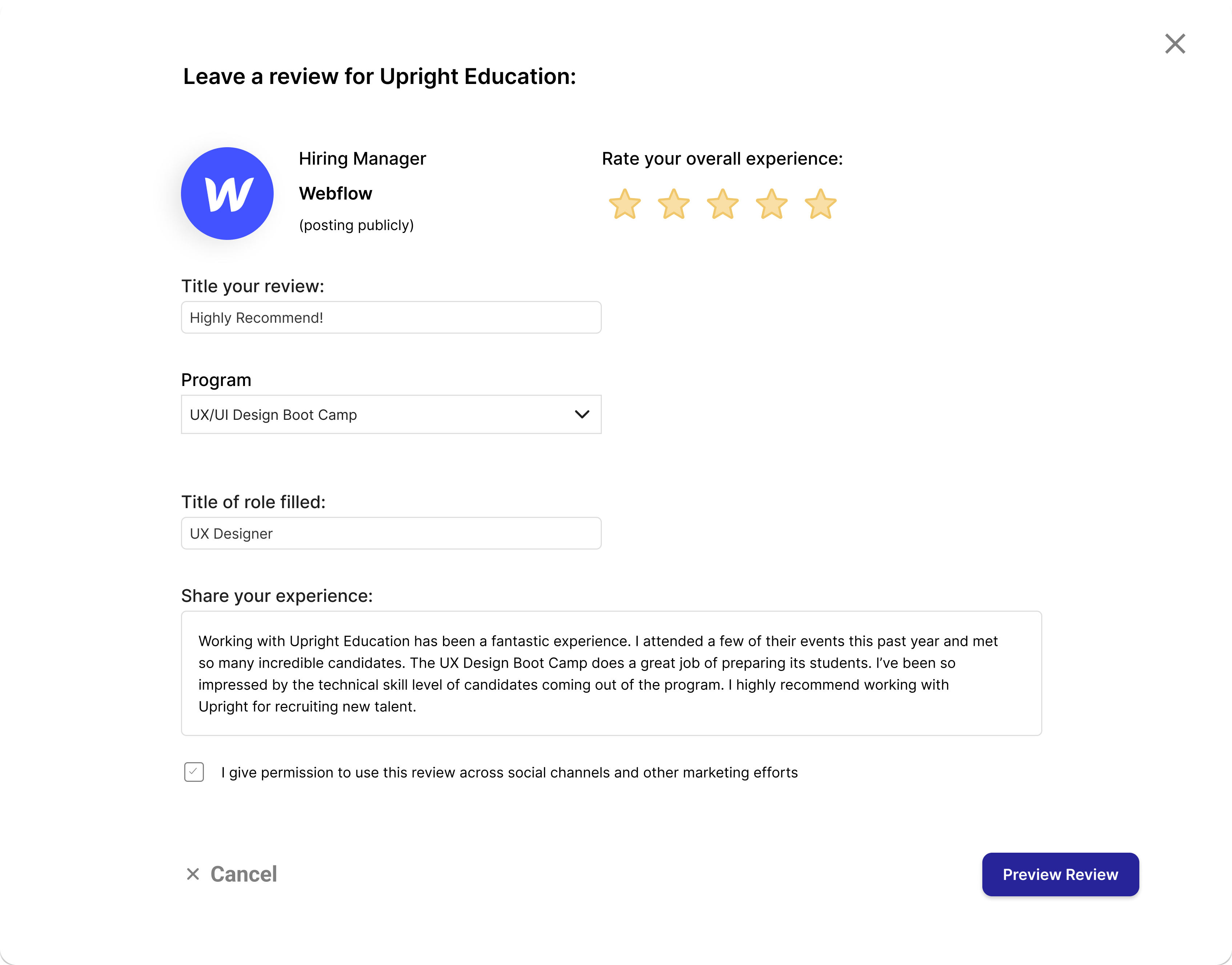
Designing a new review system for community partners to request reviews from the employer partners.
Our team decided to include both of the above requests in our statement of work agreement for this project.
Our goals: understand the Prentus product and brand more deeply, as well as their perspective for the project.
Questions asked included:
Who is their target audience?
What is the full extent of their services?
What would a successful outcome for the project look like for you?
Resources obtained:
Access to Prentus Clickup project management environment
Access to Prentus Bubble brand management environment
Heuristic Evaluation
Heuristic analysis results chart.
This method analyzes a digital product’s usability according to how well it meets each of a set of accepted usability criteria known as heuristics.
Our analysis produced that the Prentus website:
has unclear calls to action,
has counterintuitive navigation,
is difficult to figure out how to take next steps while using the site, and
uses inconsistent and unclear language.
Based on our results, we made the following recommendations:
Alter primary and secondary navigation to be more intuitive.
Increase usage of familiar and consistent language.
Consolidate pages that contain related content focus navigation.
Increase visibility of valuable content.
Competitor Analysis
We conducted a competitor analysis for Prentus, where we analyzed features of competitor websites for businesses with similar products. Competitors analyzed:
Hired
Handshake
AngelList
We also evaluated comparator websites which offer parallel functionality to the Prentus’ site project requests. Comparators analyzed:
G2
Testimonial
Google Reviews
Features analyzed (encompassing both onboarding and review system parts of the project) included:
Sign-up page
Guided onboarding walkthrough
Welcome landing pages
Dashboard navigation and components
Side and top navigation
Review sections with quantitative and qualitative reviewing styles
Review solicitation and confirmation systems
Partial feature analysis: Google Reviews.
MoSCoW Matrix
Part 1: Employer Onboarding
Part 2: Review System
After compiling features from the above competitor and comparator sites, we organized them by priority using MoSCow matrices, pictured here.
The name of this tool is an acronym whose capitalized letters refer to the categories where the features are placed in the matrix, denoting their priority whether to include in the design:
Must have
Should have
Could have
Won’t have
Determining where each feature goes in the matrix depends on how necessary that feature is to be included in order for the final product to achieve its goal. In other words, whether the feature is vital to the Prentus website carrying out its primary function for its users.
Problem Statement
The problem statement summarizes known user frustrations, based on the input we received from our client’s at the initial stakeholder meeting.
A problem statement’s purpose is to summarize what is at the core that the design aims to solve.
Tech employers need a convenient and robust recruiting platform in order to effectively source talent from trusted bootcamps and learning communities.
Why Statement
To hire outstanding bootcamp graduates from
trusted partner communities through a centralized and integrated recruiting platform.
A slightly different tool, the why statement’s purpose is to encapsulate the reason why the user wants to engage with our client’s product.
Both the problem and why statements grounded our design in the user’s core goals and what they are encountering when they access Prentus. We composed and referred to both of these statements throughout our design process to form stronger empathy with Prentus users.
User Interviews
User interview script preview from the Prentus project.
Our user research process started with user interviews. Due to the time constraints of this project, we combined the interviews into the same meetings with the first round of usability testing (covered in the next section). These confidential sessions were recorded after obtaining consent.
Since our project timeline fell over the Thanksgiving holiday, our user recruitment included a Google Form questionnaire to gauge interest as well as Calendly to increase convenience.
We met with participants remotely over Zoom using a 2-on-1 interview format: one teammate as the interviewer and one acting as the note taker. Using a script we co-wrote (see the image), we conducted semi-structured partially conversational interviews.
What we learned:
User participants have experience hiring tech boot camp graduates and/or they are interested in doing so.
Their professional experience includes recruiting, human resources, education career services, and upper management.
Usability Testing: Round 1
Our usability tests were conducted remotely immediately after the interviews during the same sessions.
Goal: Test the usability of the existing Prentus platform.
Rationale: To gain user input on what’s working and what isn’t with the current design.
In our first round of usability testing, four users each took on the role of a hiring manager and attempted two tasks on a prototype of the original Prentus website:
Task 1: sign up and create a profile
Task 2: add a talent partner.
Results:
Task 1: 4 out of 4 users successfully completed the task
Task 2: 1 out of 4 users successfully completed the task
This means the existing Prentus website seems usable enough for most typical users in their target audience to sign up and create a profile (task 1). But there seem to be serious issues with the current design that prevent most users from adding a talent partner (task 2).
Results from Usability Testing: Round 1
User Feedback
Regardless of their success at the tasks, many users had feedback about their experience.
Challenges presented:
How to add community partners
Understanding the events and calendar functions
Onboarding tour doesn’t cover all the site’s functions
Confusion from some of the terms and labeling
Suggestions offered:
Clarify the types of interivews able to schedule
Add information about how billing works
Candidate profiles with job experience, soft skills, and hard skills
Address issues with LinkedIn import during onboarding
User Input from Usability Testing: Round 1
Note: Usability Testing Round 2 will be discussed after prototyping.
User Archetype
As UX designers, the ‘UX’ stands for user experience. We aren’t the users when we’re designing: instead we design on behalf of users. So we need a picture of the users’ collective experience to more fully empathize with them as we create solutions.
The user archetype synthesizes insights gathered from our interviews and usability testing, creating a fictional person with whom we can empathize and center our design. User archetypes also act as representations of our users to share with stakeholders while keeping our user participant information confidential.
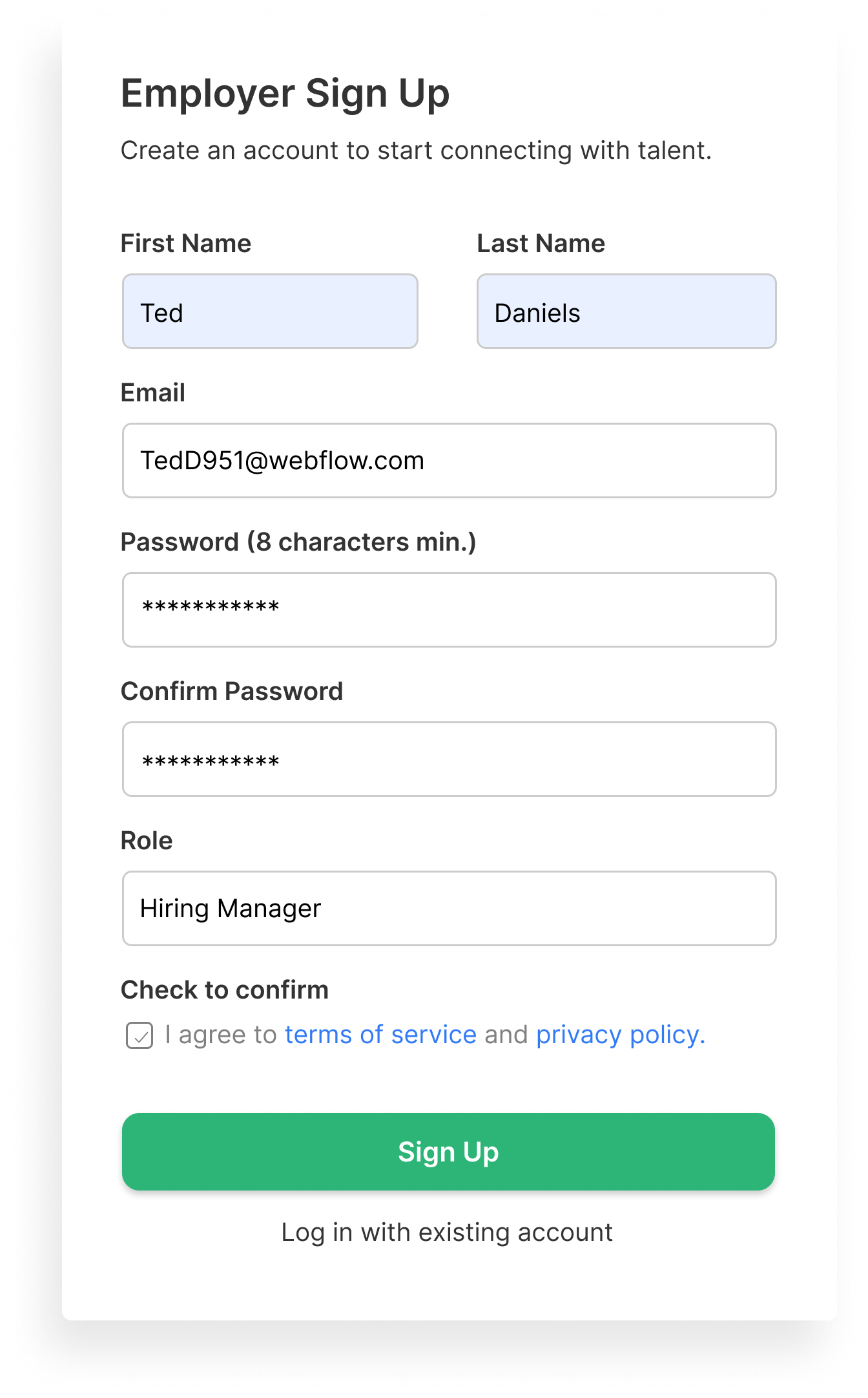
Ted, The Hiring Manager
For this project, our archetypal user is Ted, a hiring manager. Ted is not a real person, but an amalgamation of users with whom we spoke. This graphic shows Ted’s goals and needs, as well as thoughts, feelings, and pain points or frustrations he experiences during the hiring process.
Customer Journey Mapping
To increase our empathy with users like Ted and typical situations he encounters as he interacts with Prentus, we created customer journey maps for each part of this project.
A customer journey map shows a user’s actions, thoughts, feelings, and opportunities over time as they interact with the product in a particular scenario. For example, in the graphics shown:
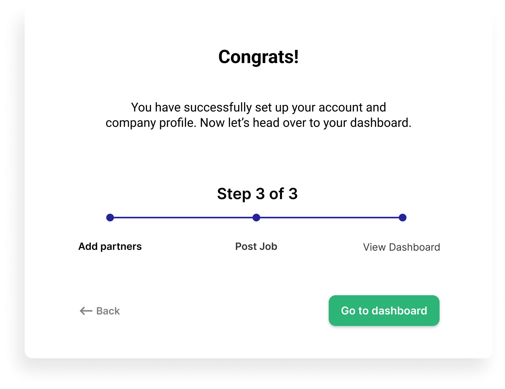
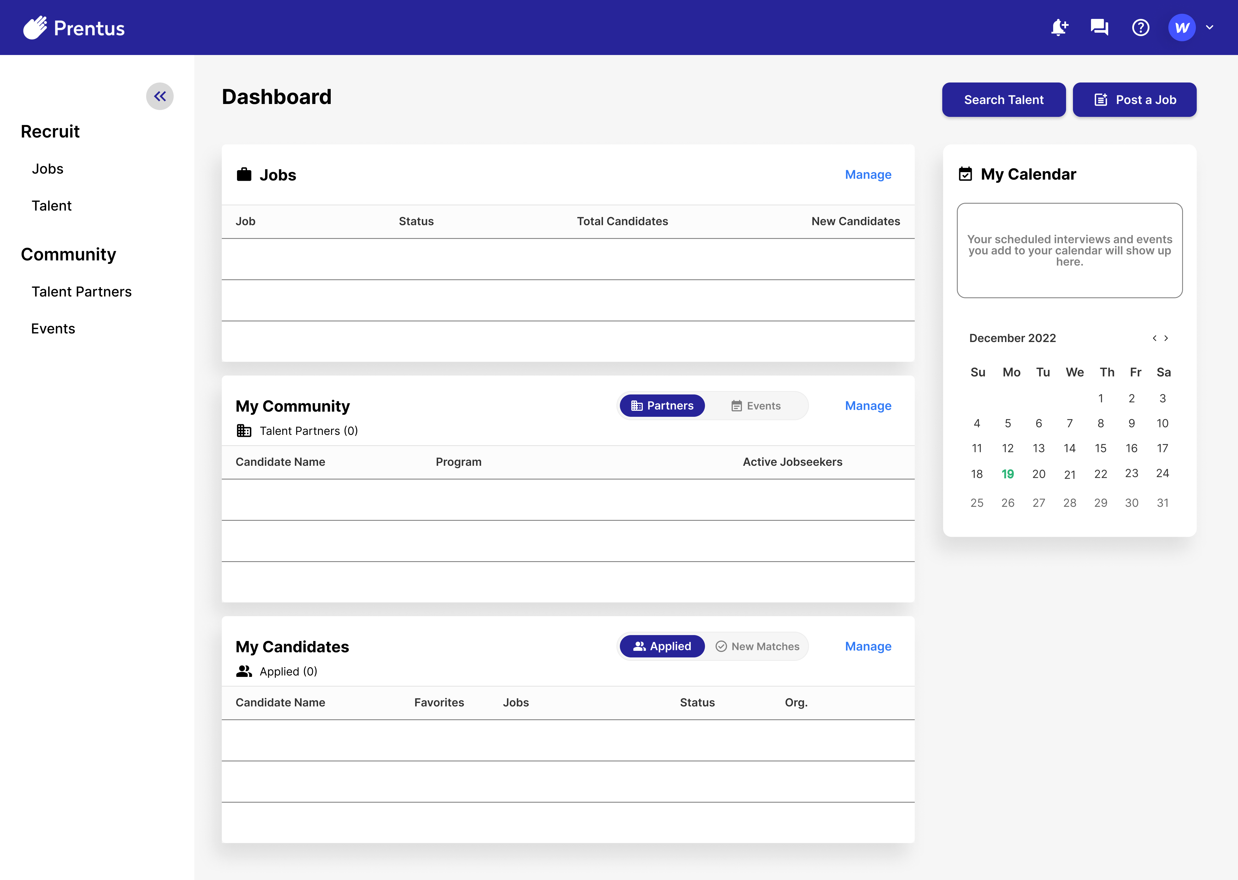
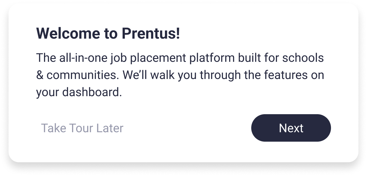
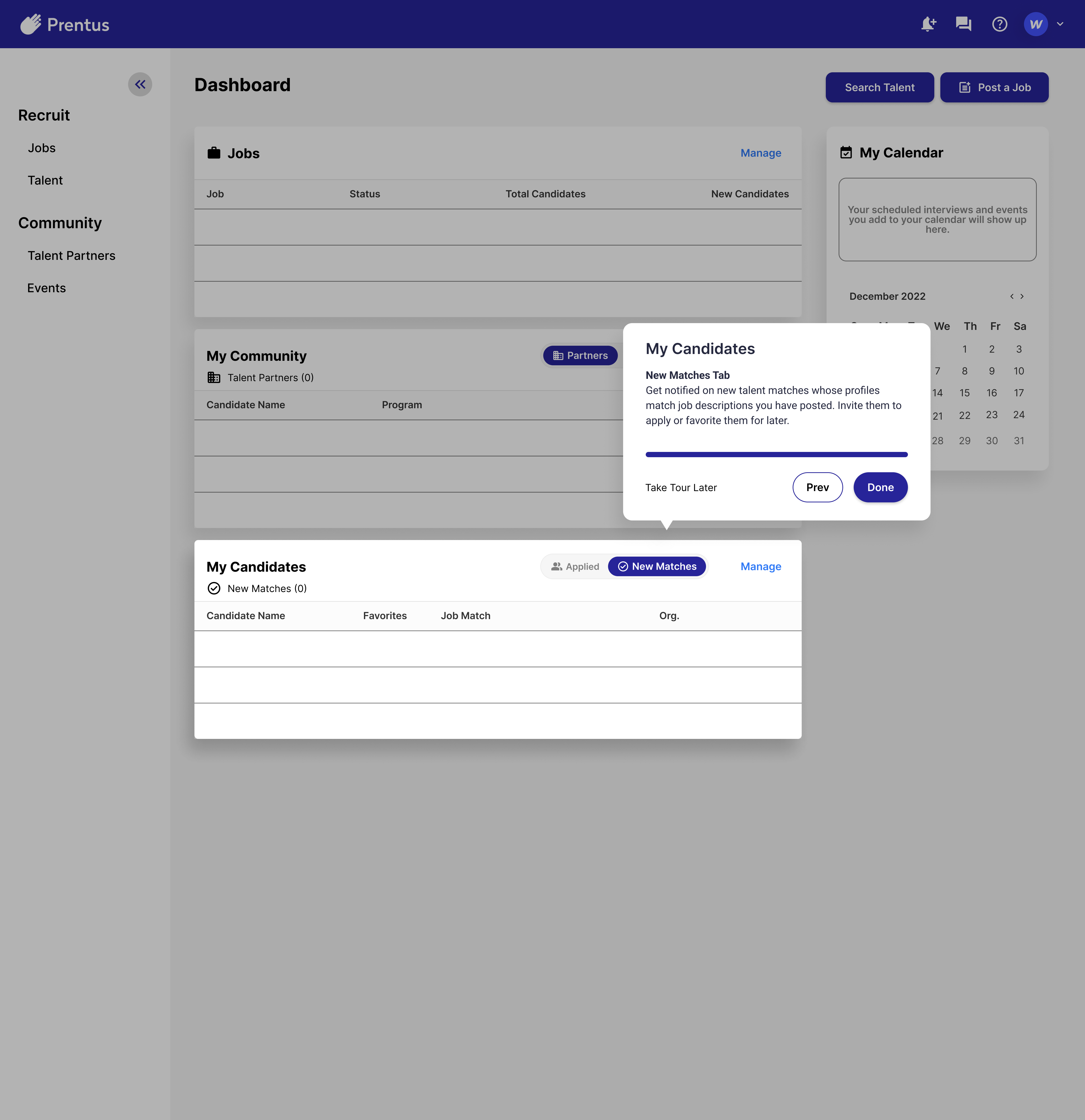
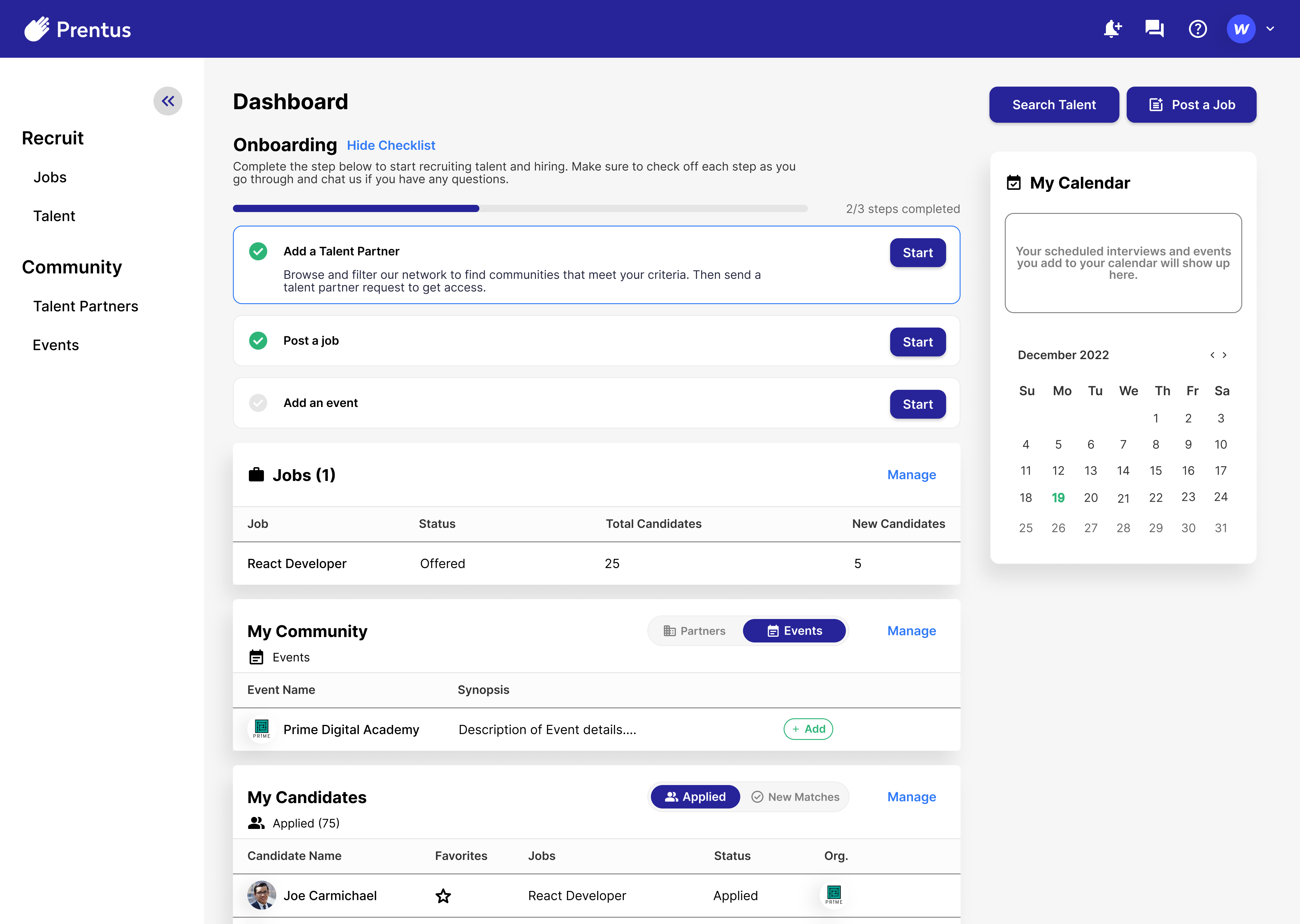
Part 1: Follow Ted’s journey after he signs up for Prentus and learns more about the platform.
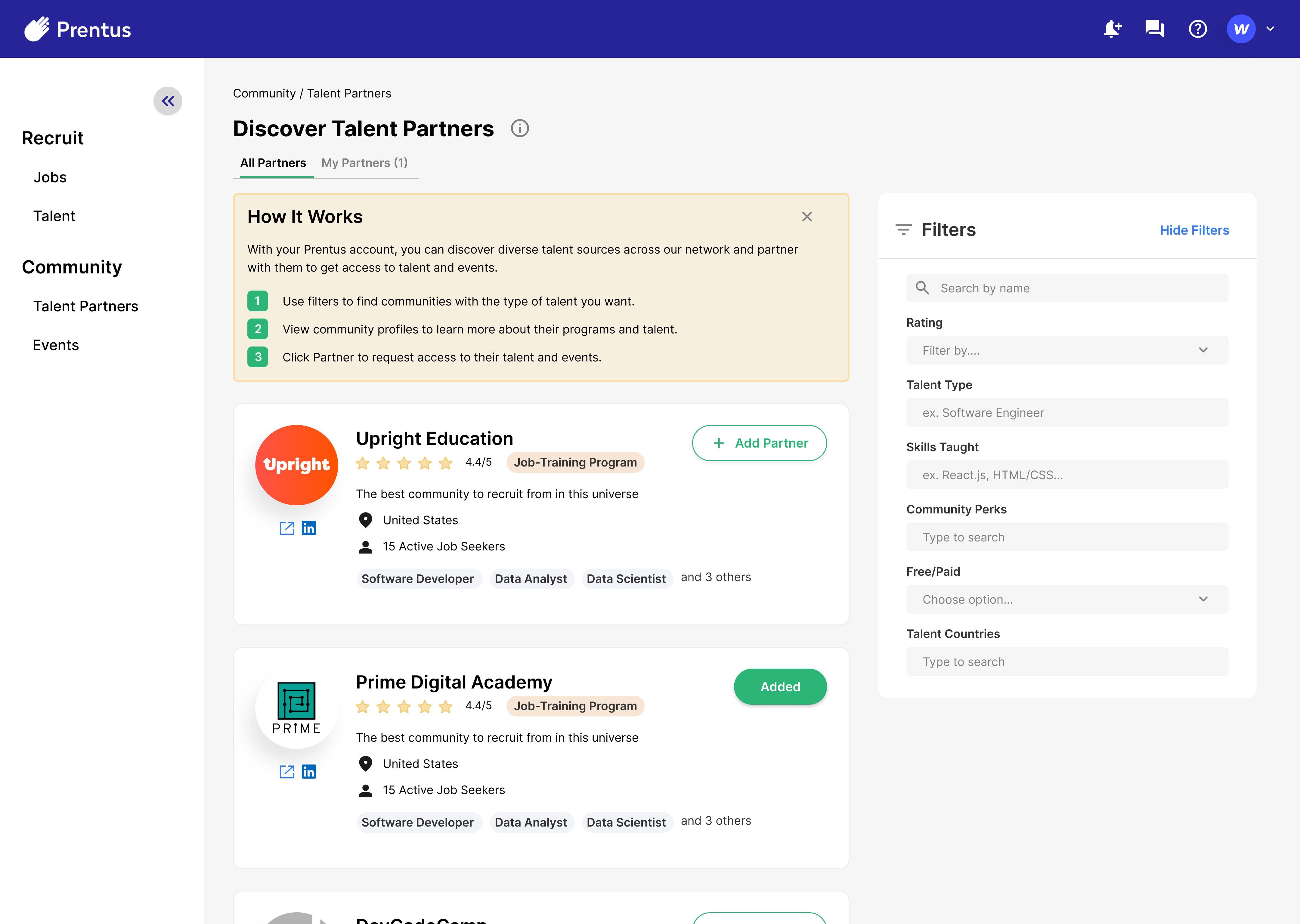
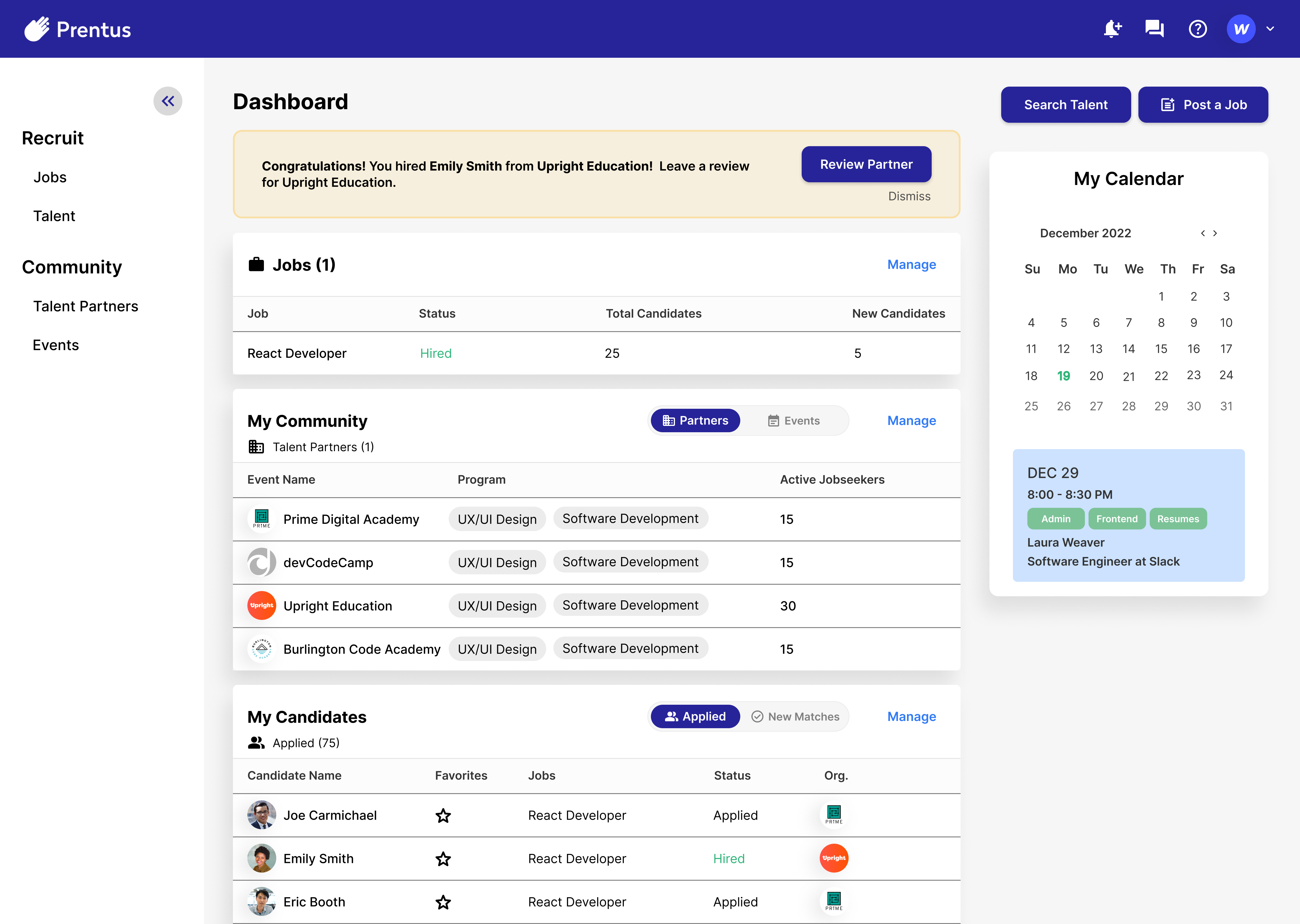
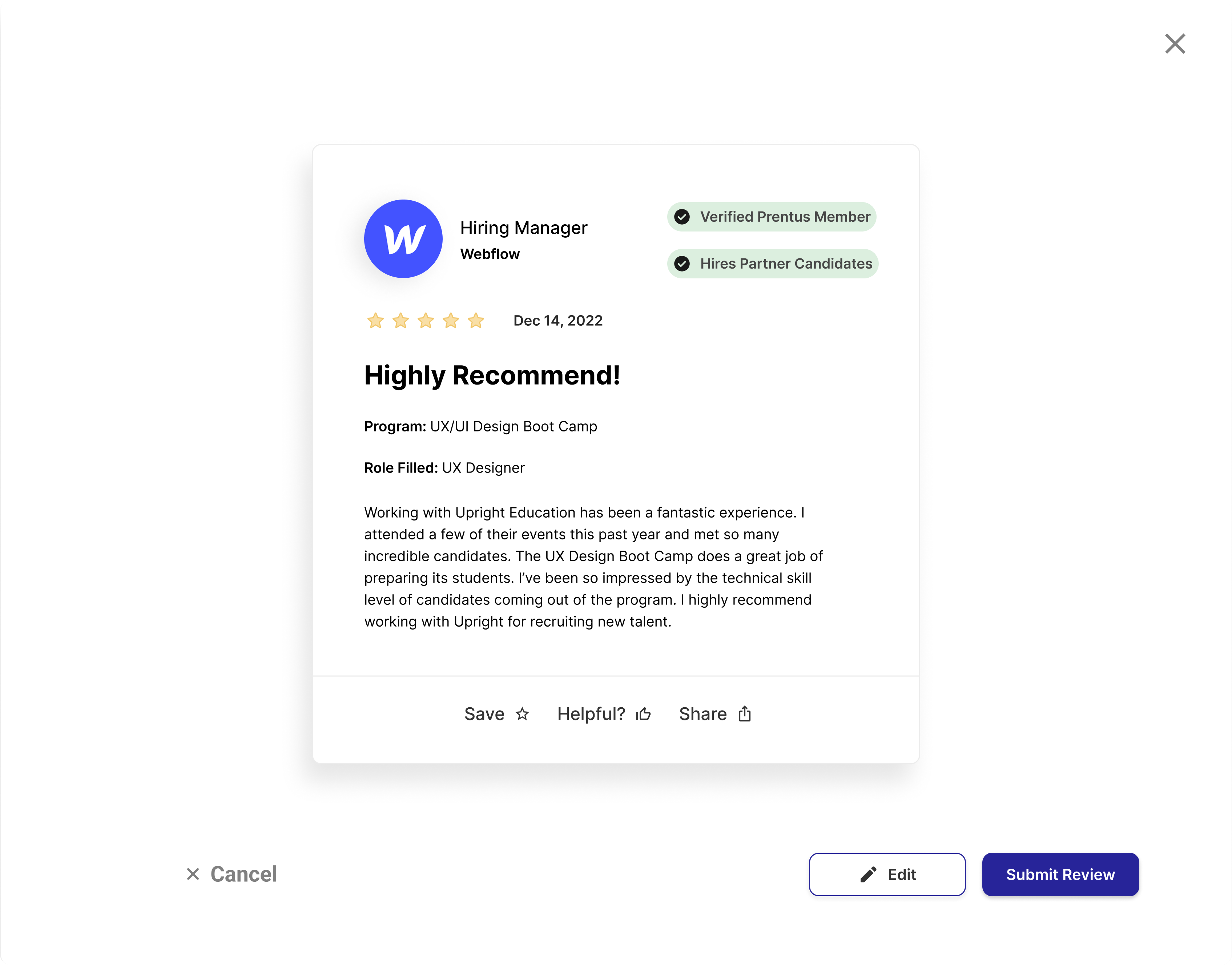
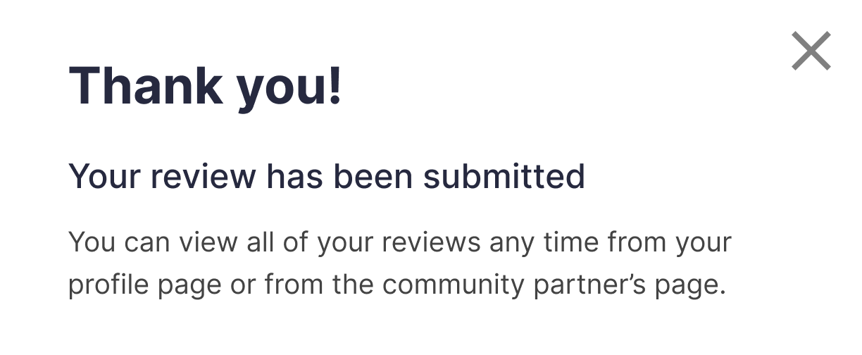
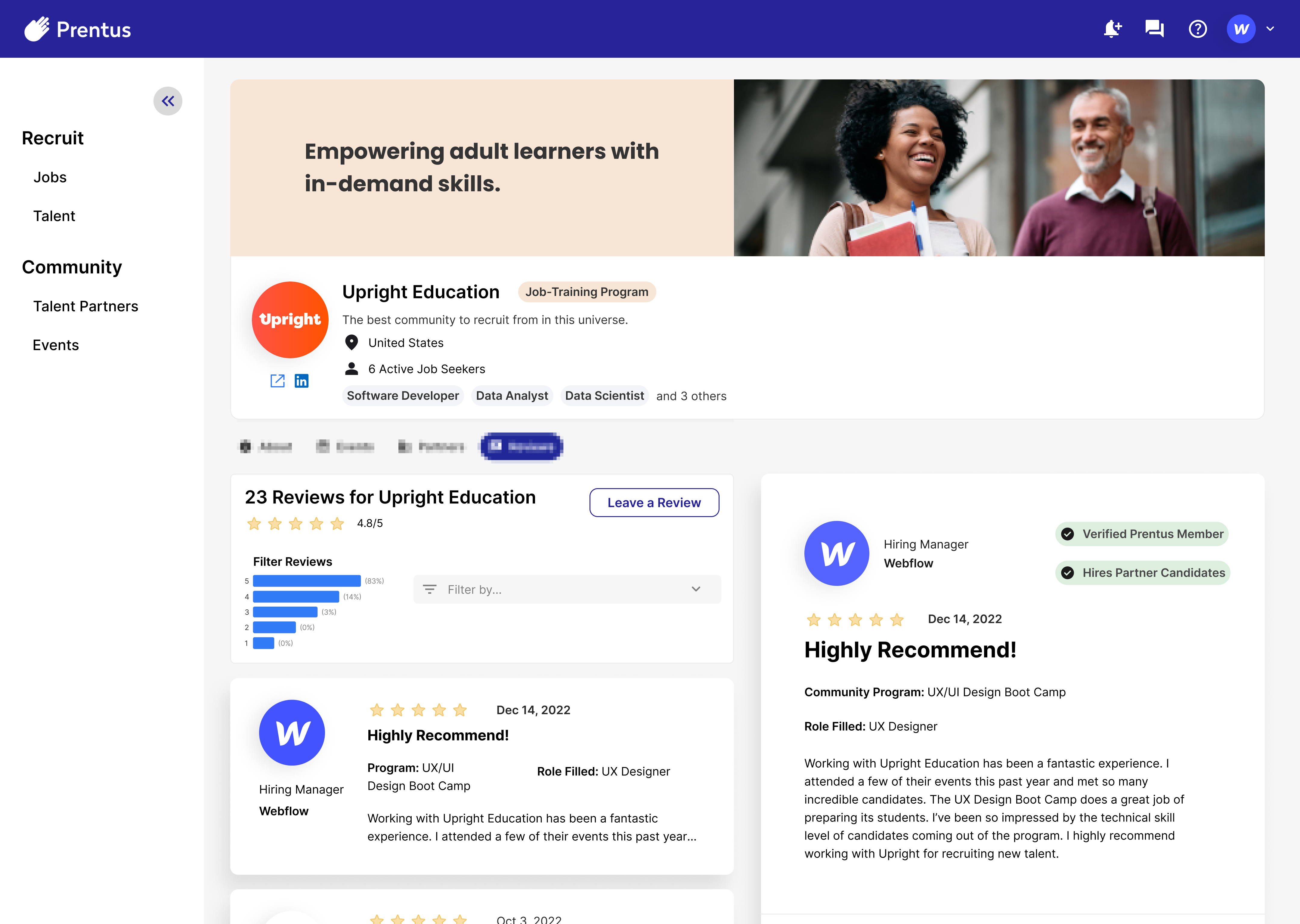
Part 2: See Ted’s experience after hiring a candidate through Prentus and being prompted to leave a review for the candidate’s talent partner.
Part 1: Onboarding
Part 2: Review System
With a set of user data and empathy-sparking tools ready, we transitioned to the design phase of our process and began creating intentional solutions.
Design
Solution Approach
The list of UI (user interface) deliverables we created to addresses our user’s goals and pain points include:
Task Flows
Wireframes
Mockup
Prototype
Stakeholder requests to include in the design:
Prentus style guide: Bubble
Layout: Figma Auto Layout
Iconography: Google Material Symbols
Prentus Branding
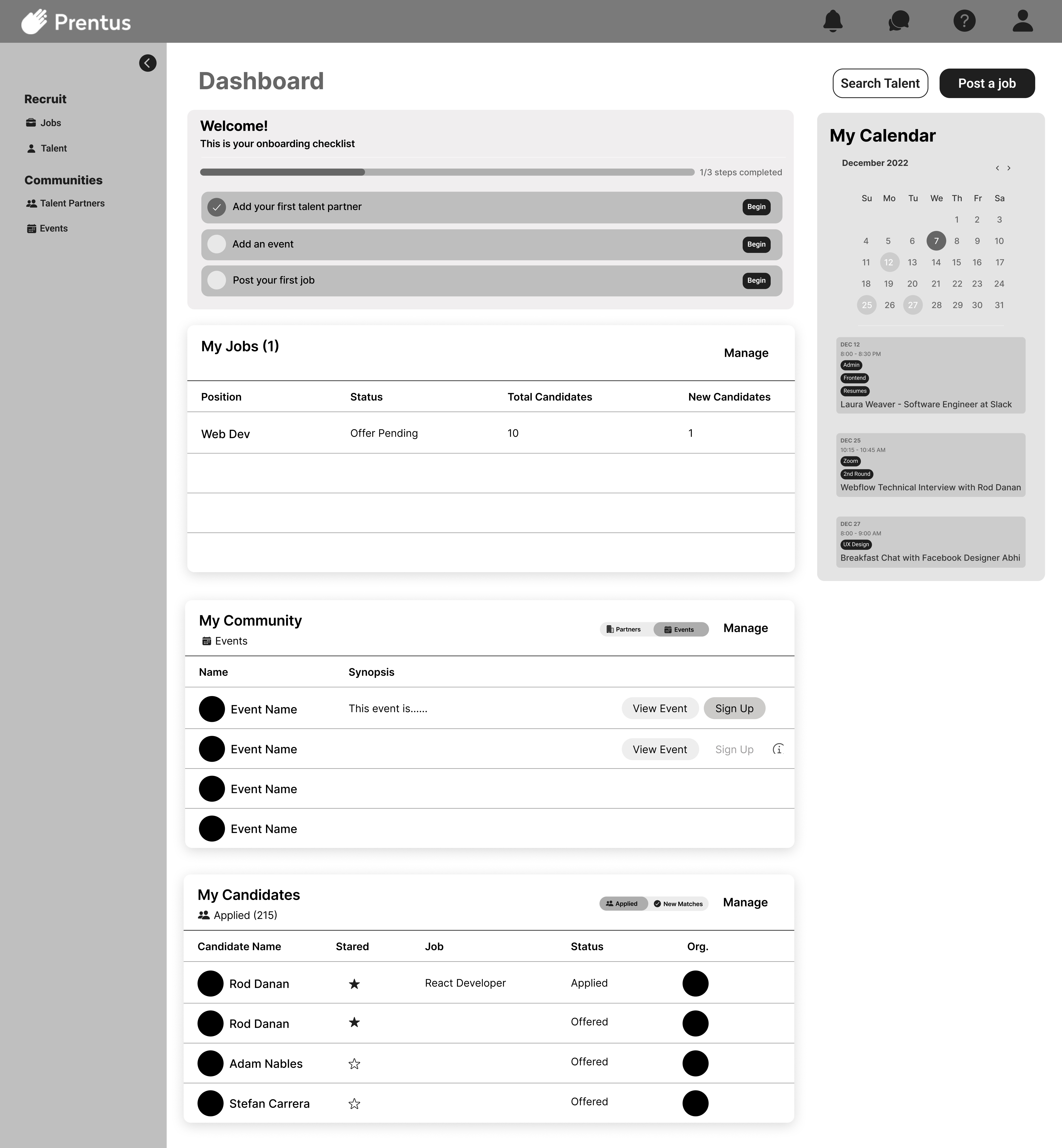
To begin the UI design, we accessed Prentus’ existing style on the platform Bubble.
Components
We imported the styles from Bubble into Figma to create reusable style elements called components to use across our design. Components in Figma allow us to alter these master elements in one place, and the changes update across the project wherever copies of the component have been placed. See the gallery below for a selection of components created forthis project.
Bubble platform example: a Prentus button's specifications.
Task flows are a type of flow diagram, which is a visualization of steps users like Ted take to achieve their goals using products like Prentus.
Task flows improve product efficiency, help designers and developers identify the main steps involved in tasks, and ultimately help clients save time and money. Different from a customer journey map, task flows are intended to increase design efficiency instead of increasing empathy.
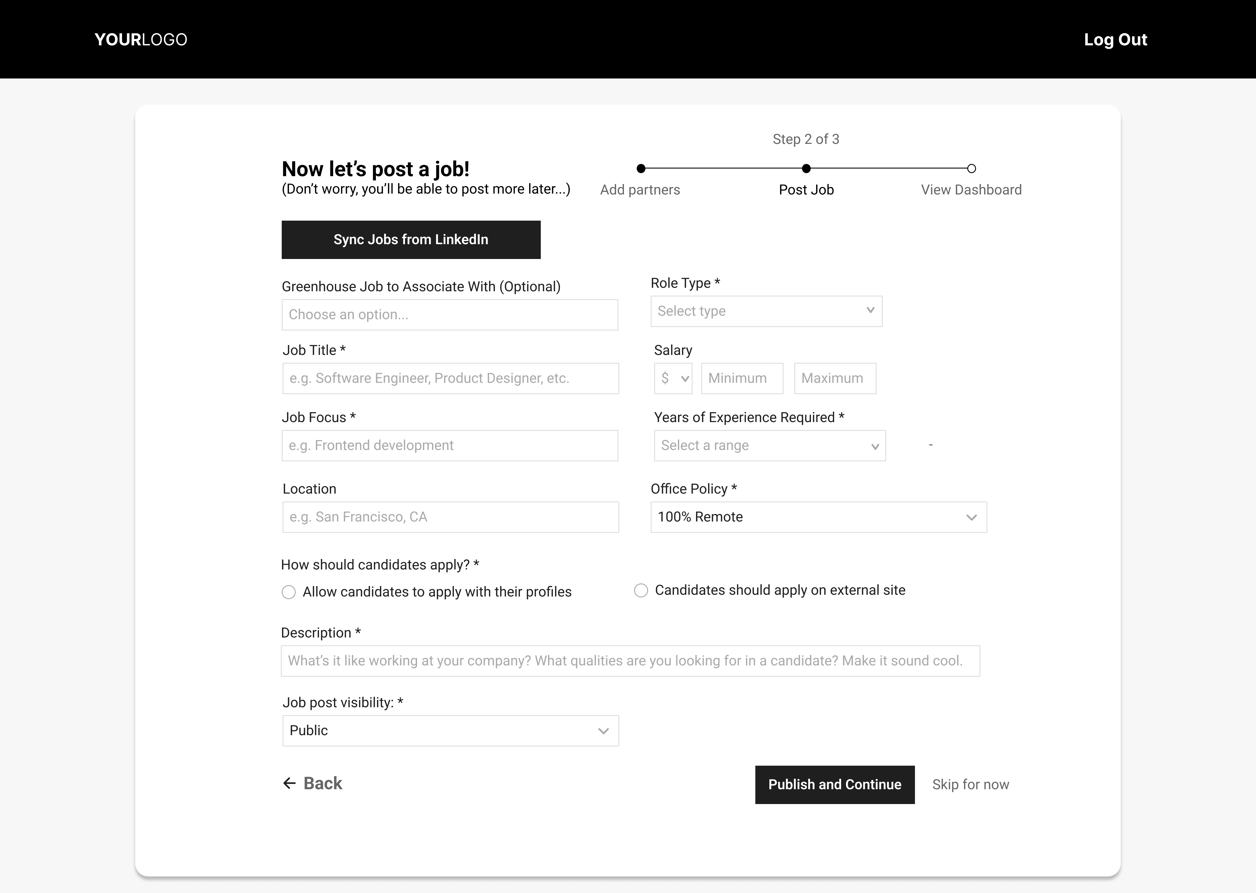
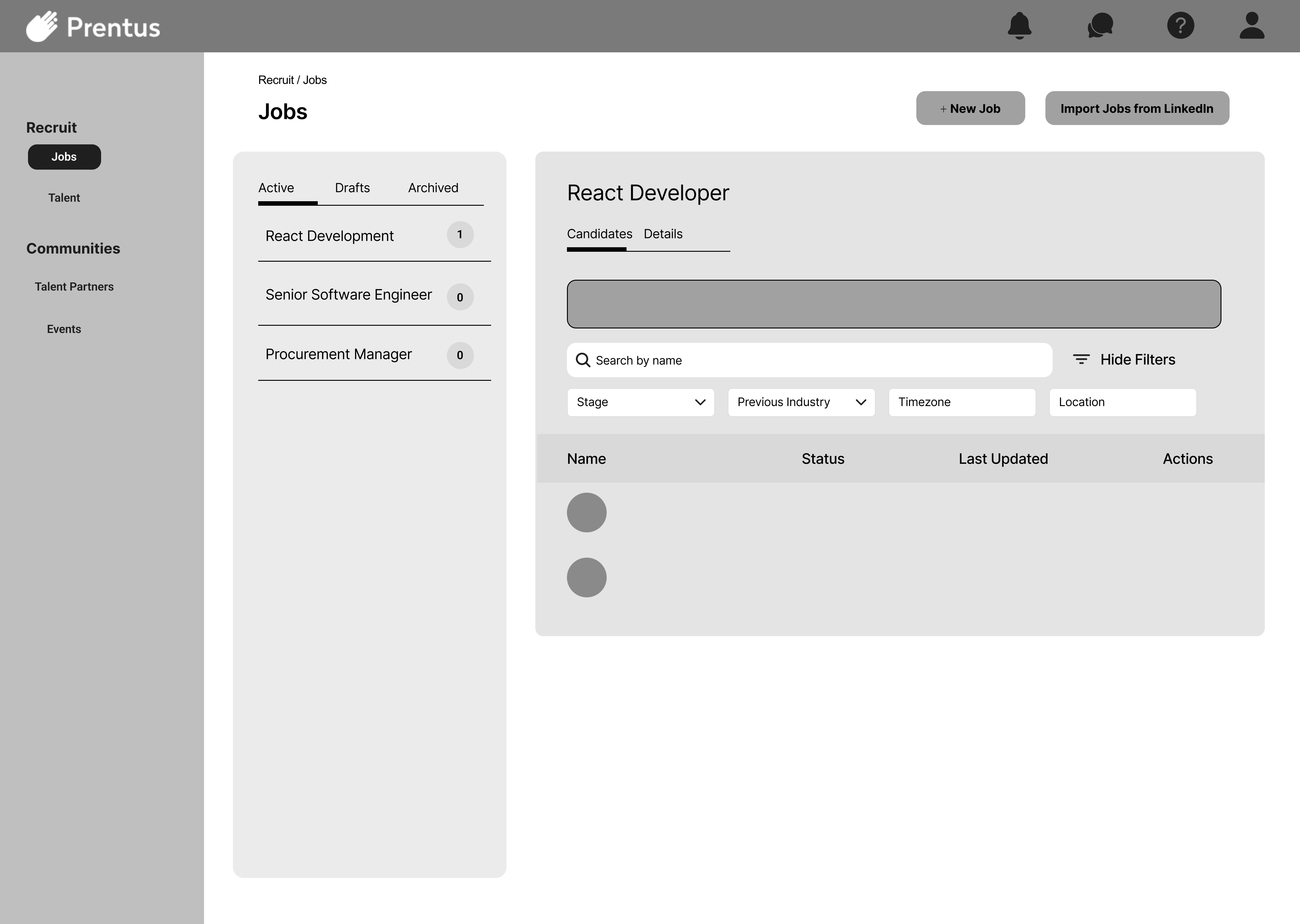
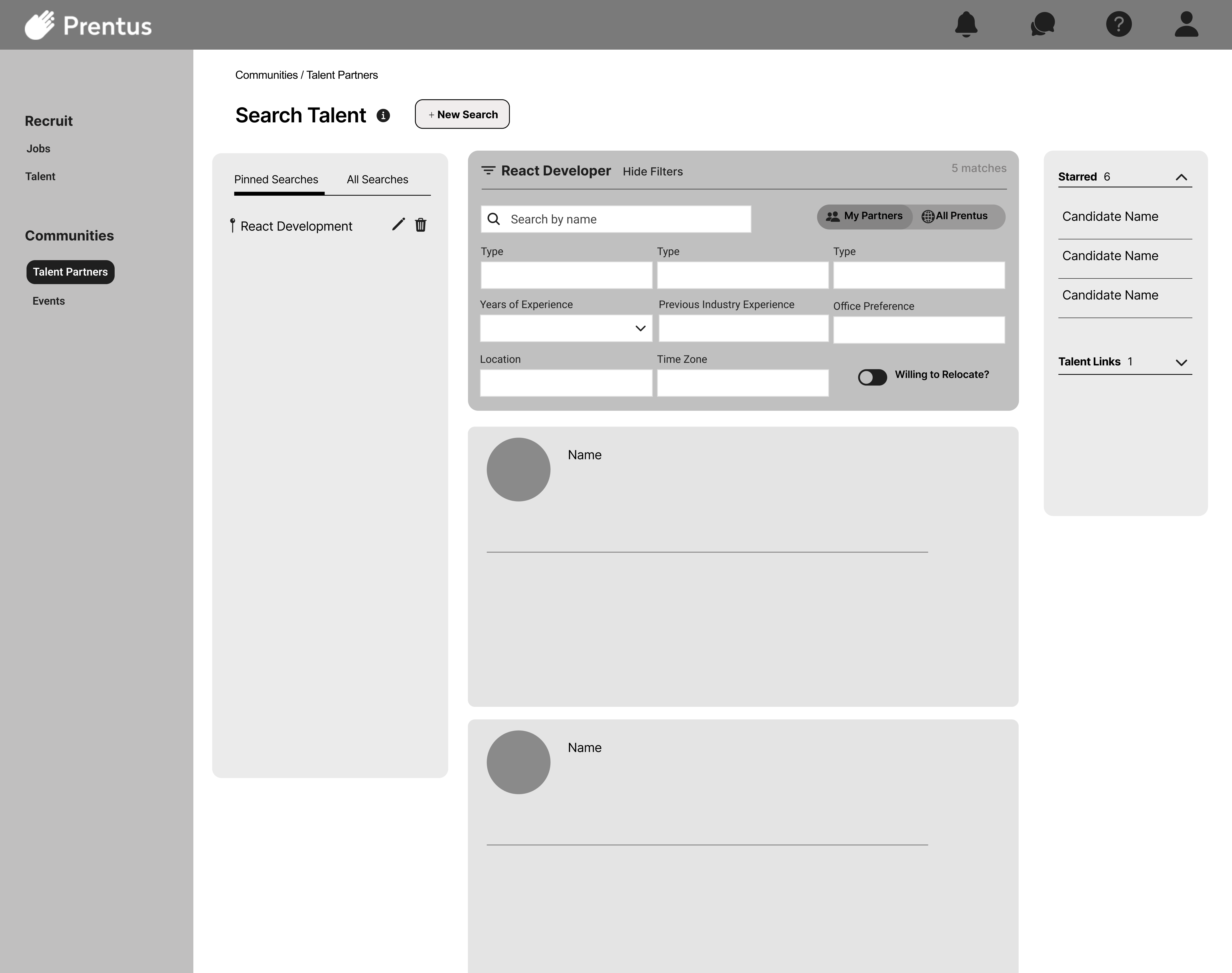
Wireframing is a crucial design step where a digital product’s visual structure is formed, including only the necessities and omitting elements like color and images. Keeping to this lower fidelity allows us to focus on the layout of the elements and how they help the user navigate to achieve their goals, without getting caught up in other visual details. The Prentus wireframes featured are medium fidelity which include some text and headlines.
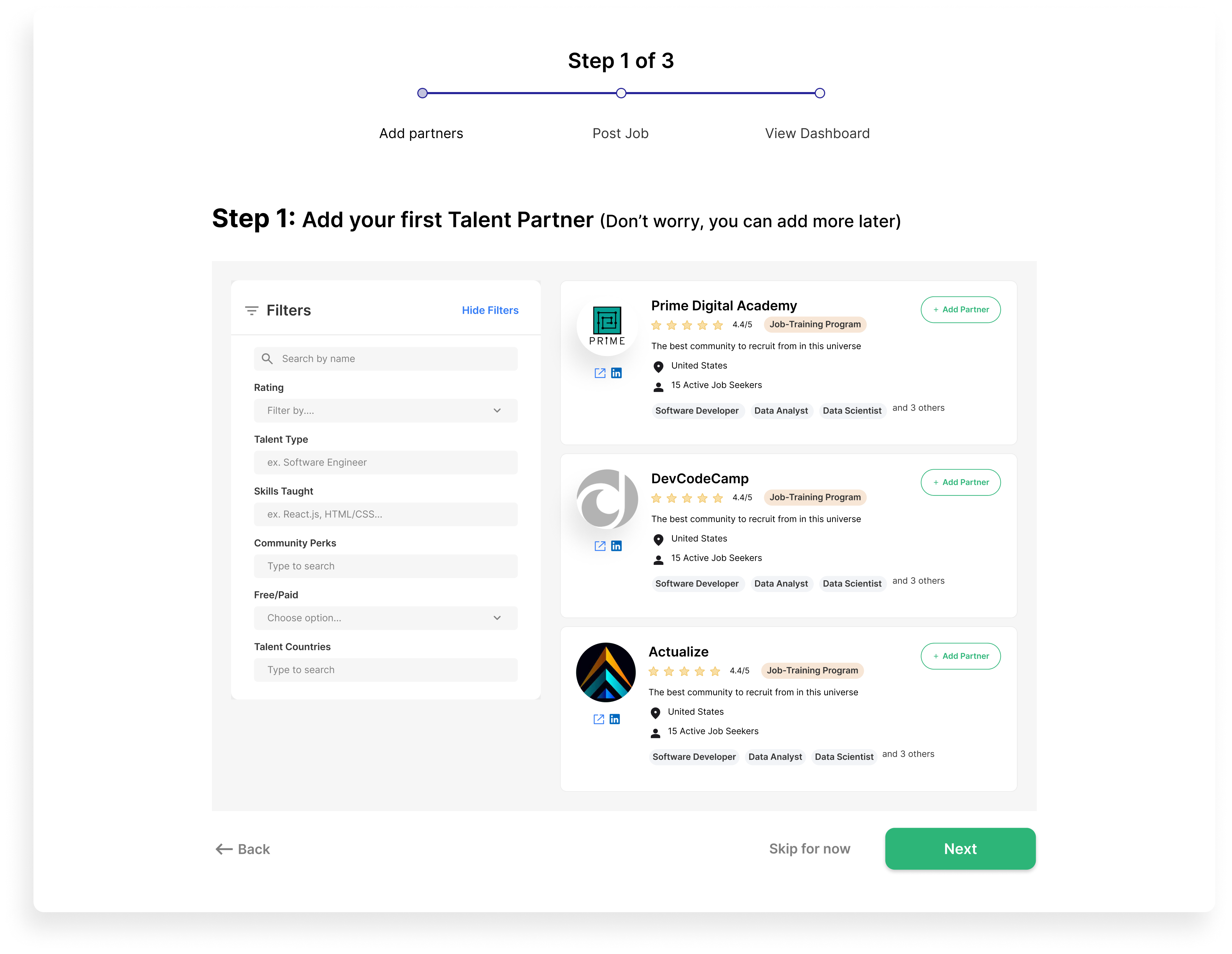
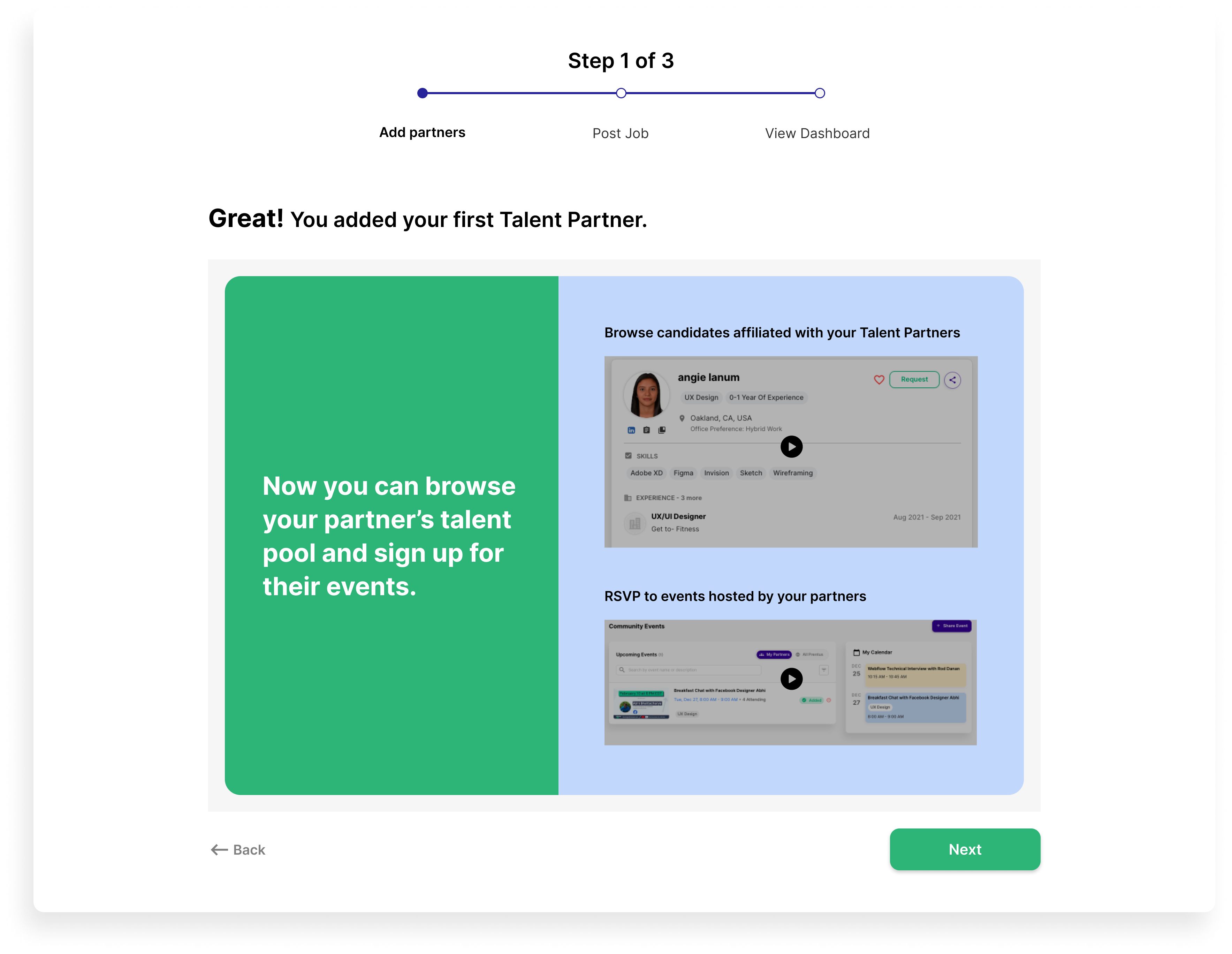
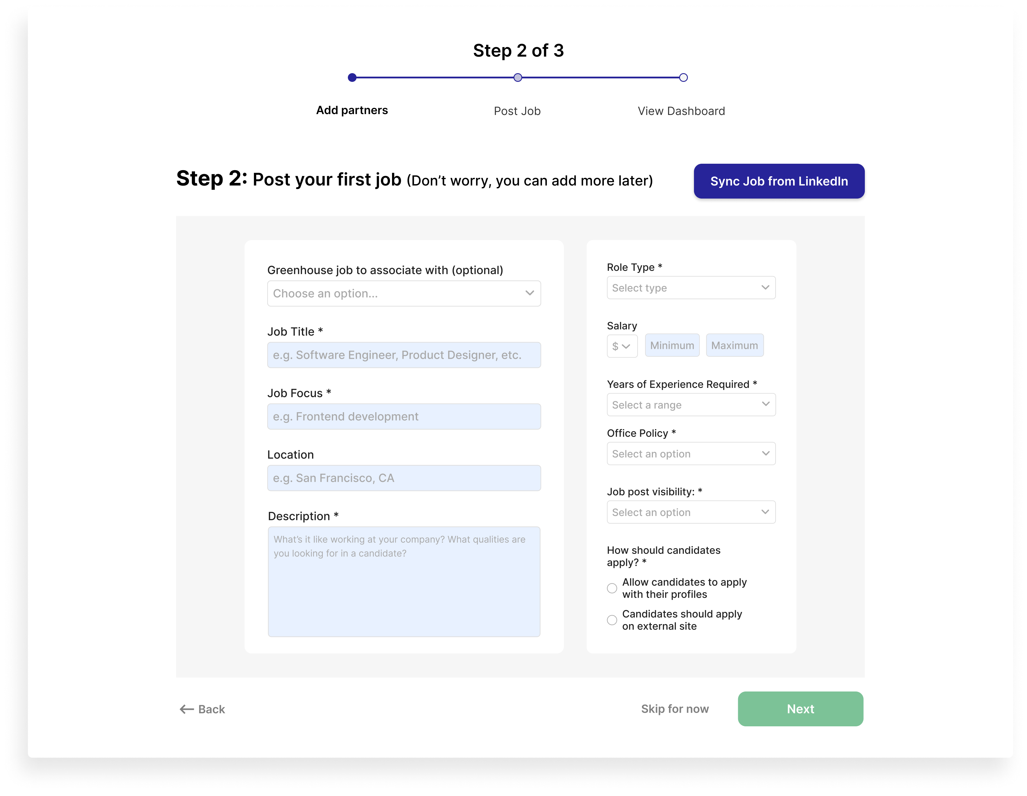
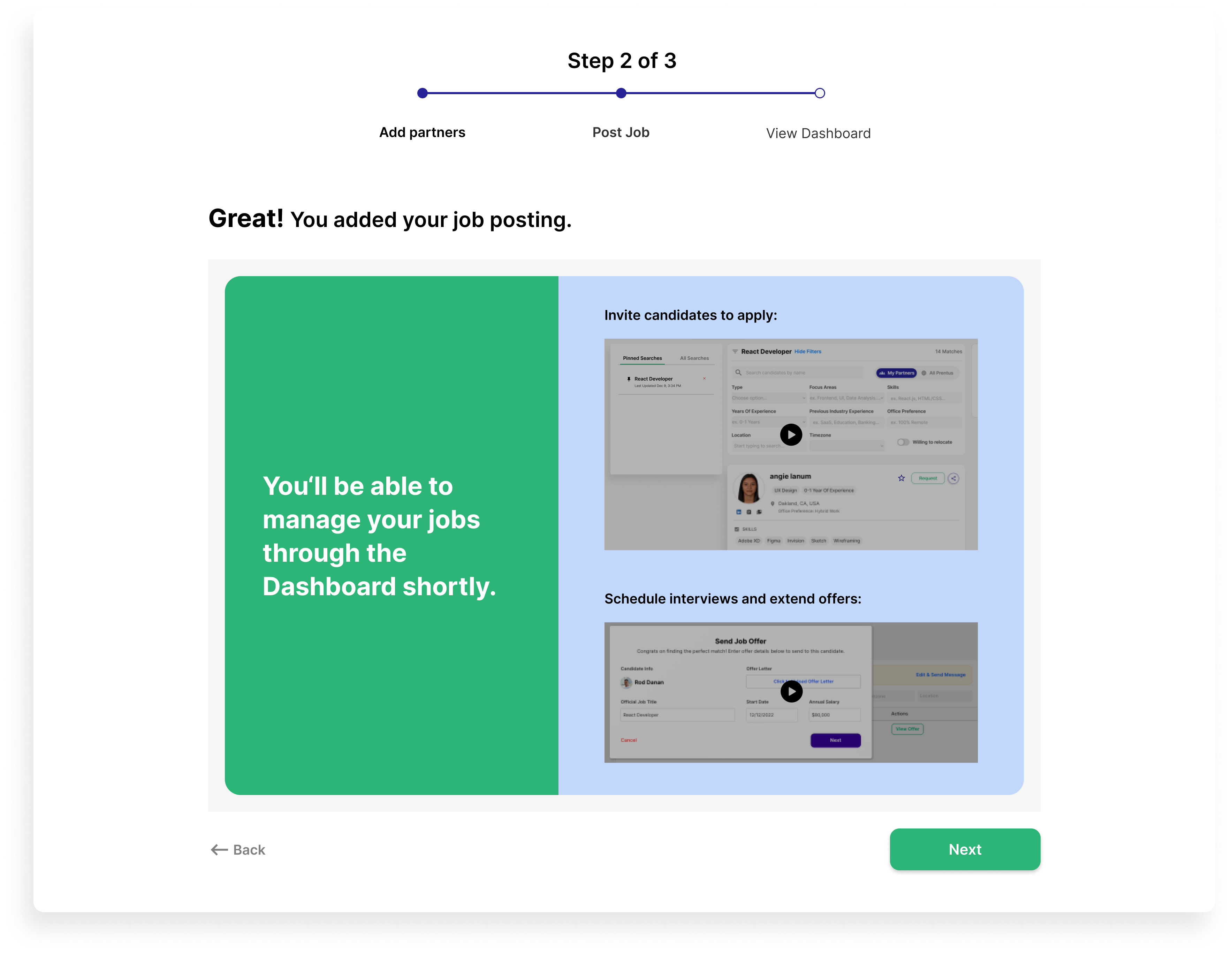
We started by wireframing the Prentus dashboard, then created wireframes for every essential step of both the onboarding process and the review system. During this phase, we referred to our earlier research results, including our user participant feedback, the MoSCoW matrix ‘must haves’ list, and details about our user archetype Ted.
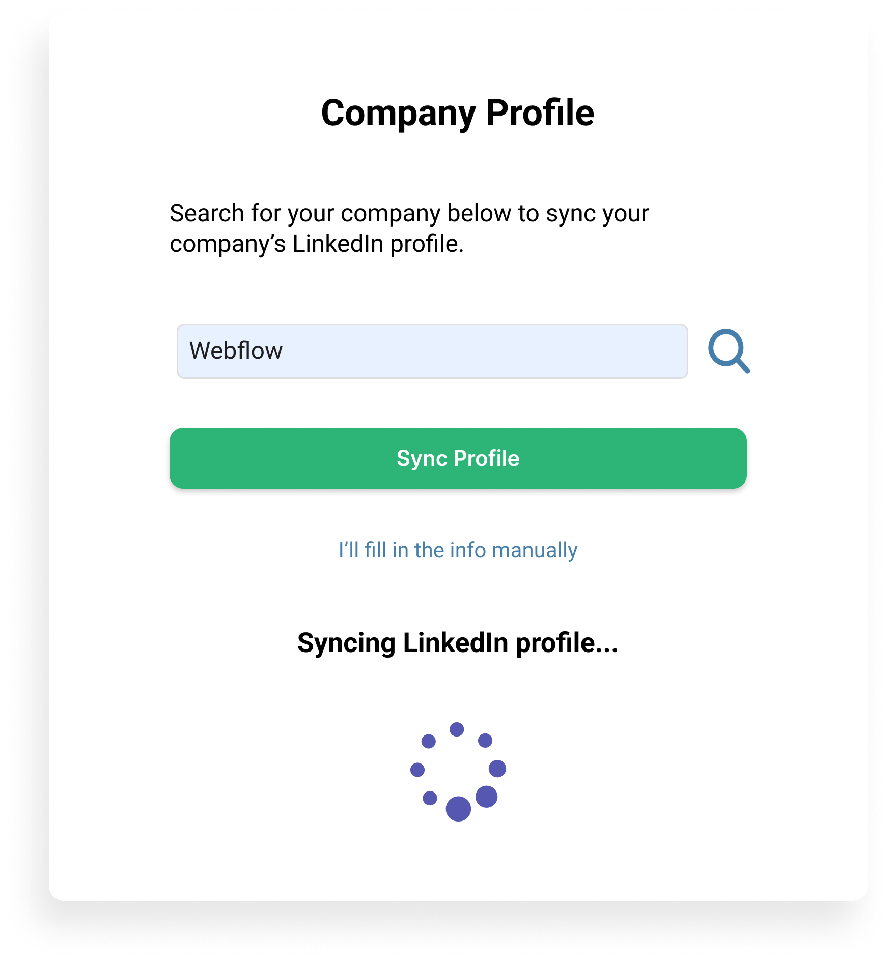
Building on wireframes, we moved onto the mockup stage. The purpose of mockups is to create a higher fidelity representation of the final product. With the addition of color, images, and text, we finalized the layout and other design details to realize our user Ted’s goals.
In this phase, we focused on the product’s visual design and its impact on the organization and structure. Mockups are static images, meaning they are simply visual representations of what will become a functional product.
While creating our mockups, we utilized the Auto Layout feature in Figma at the request of our project stakeholder. This allows design elements to grow or shrink and otherwise adapt to content changes as designs evolve.
Defining design properties with Auto Layout can ease the handoff for developers, as more consistent specifications can be added to the design.
Adding Auto Layout was one of the more difficult challenges we encountered in this project, and it added to the time needed to complete the design.
Auto Layout specifications for the Prentus calendar design in Figma.
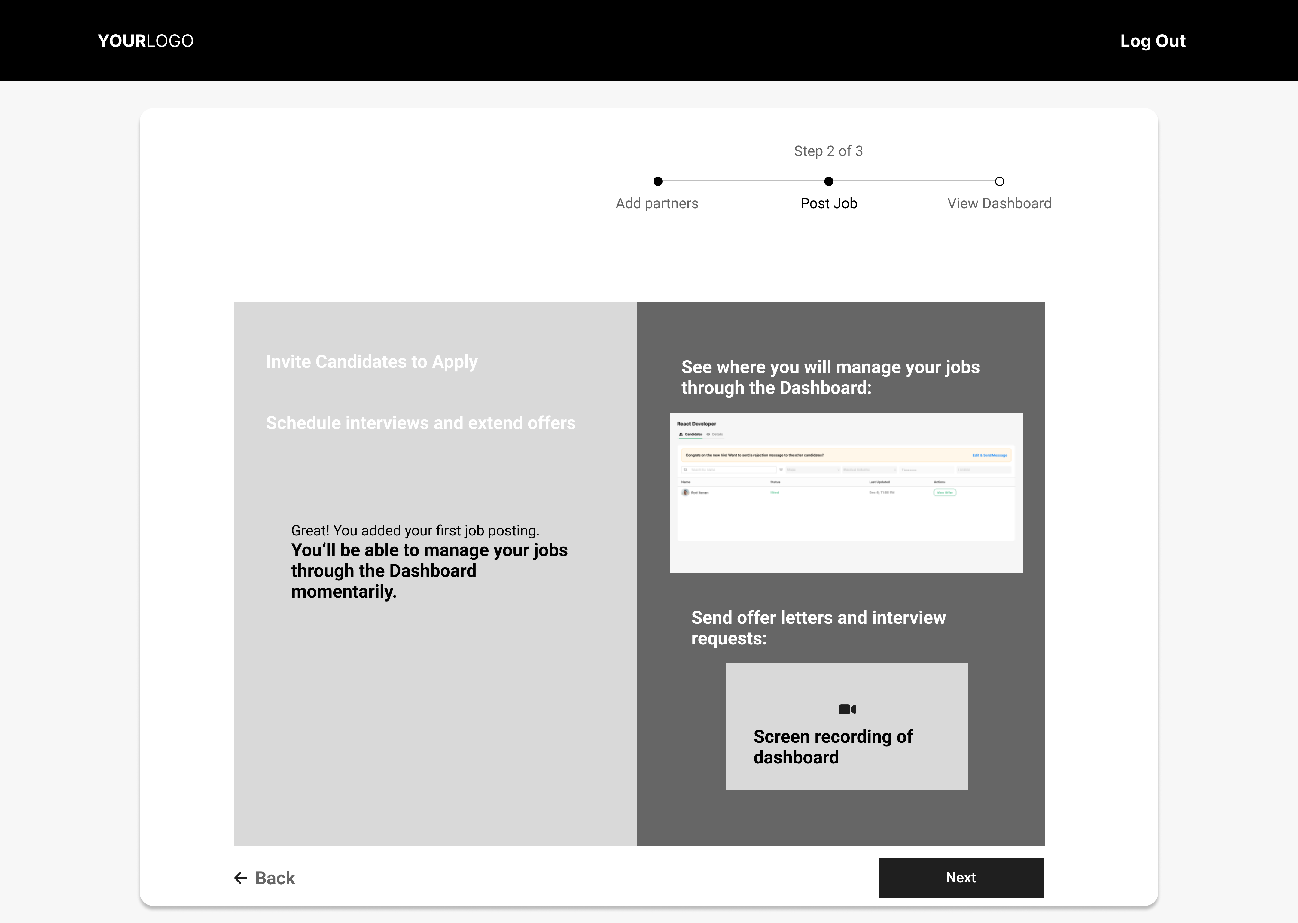
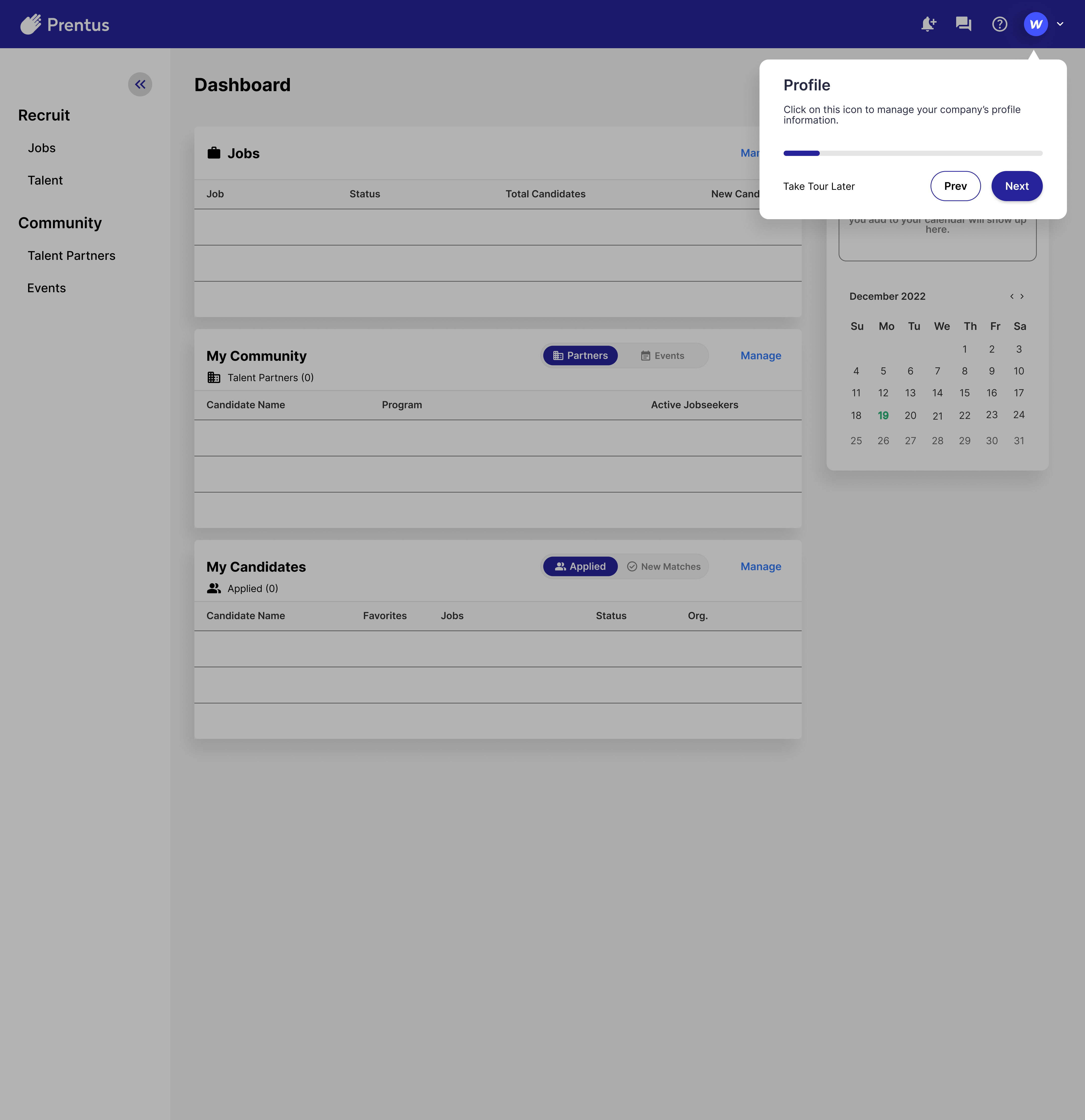
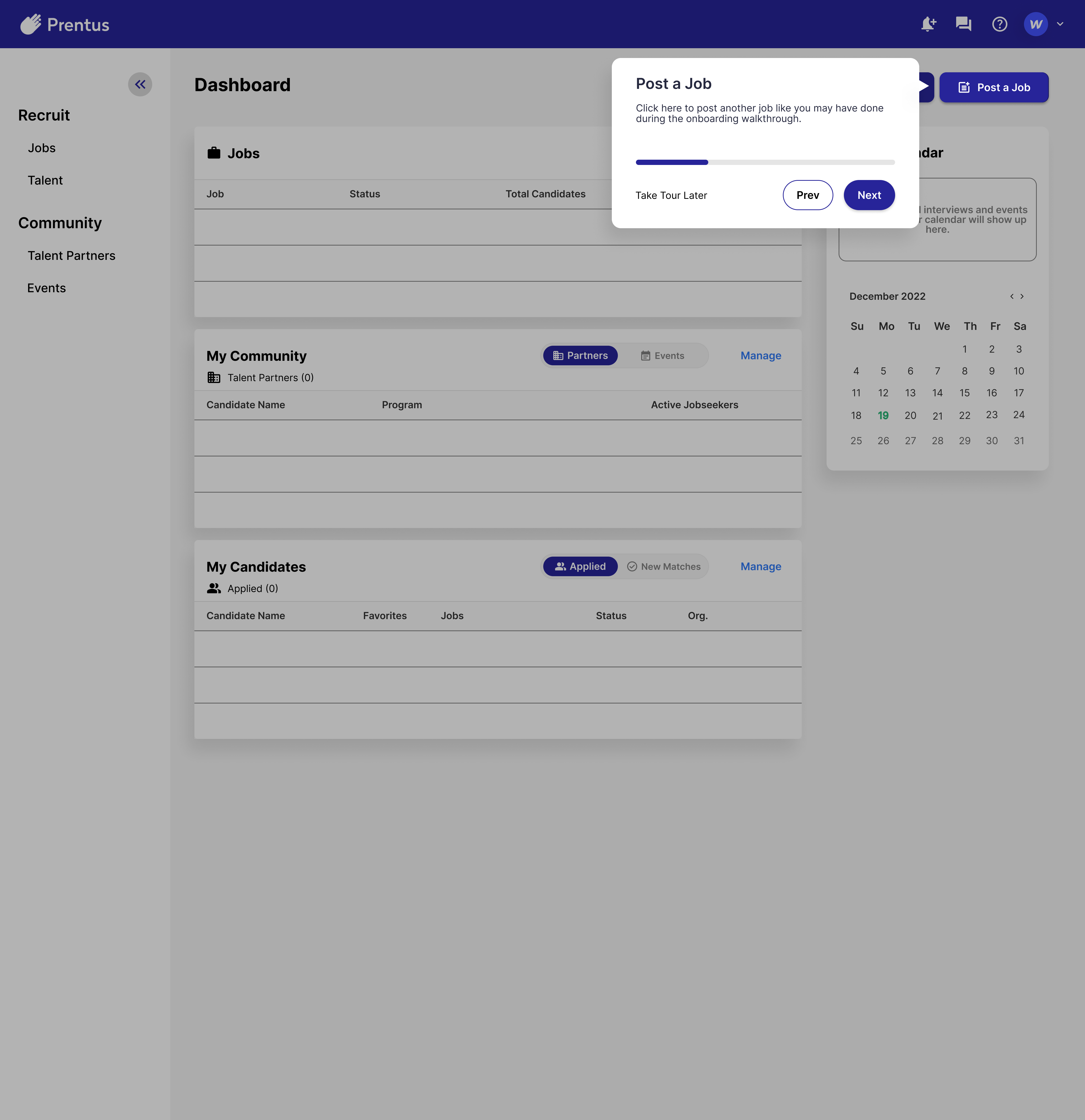
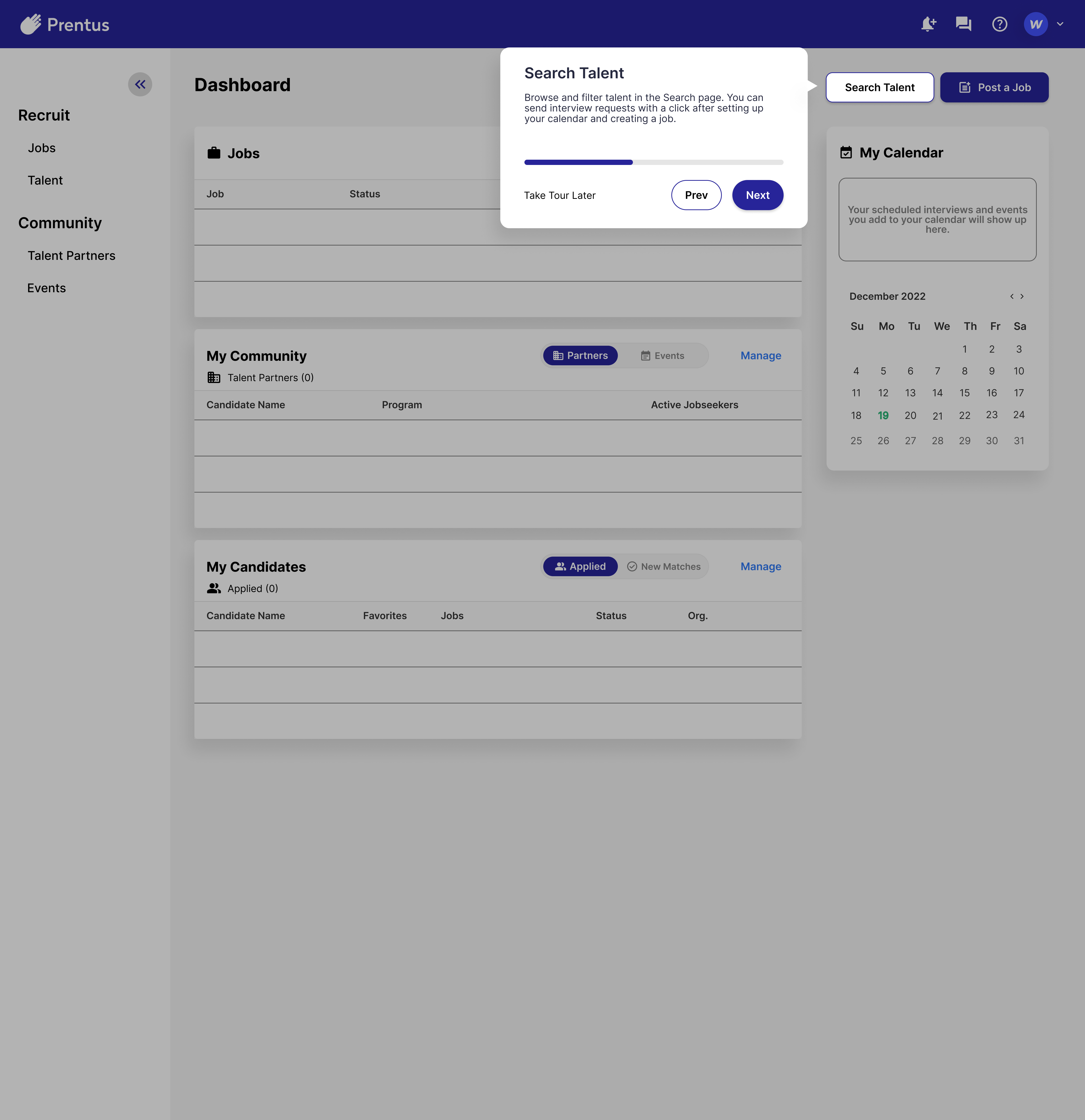
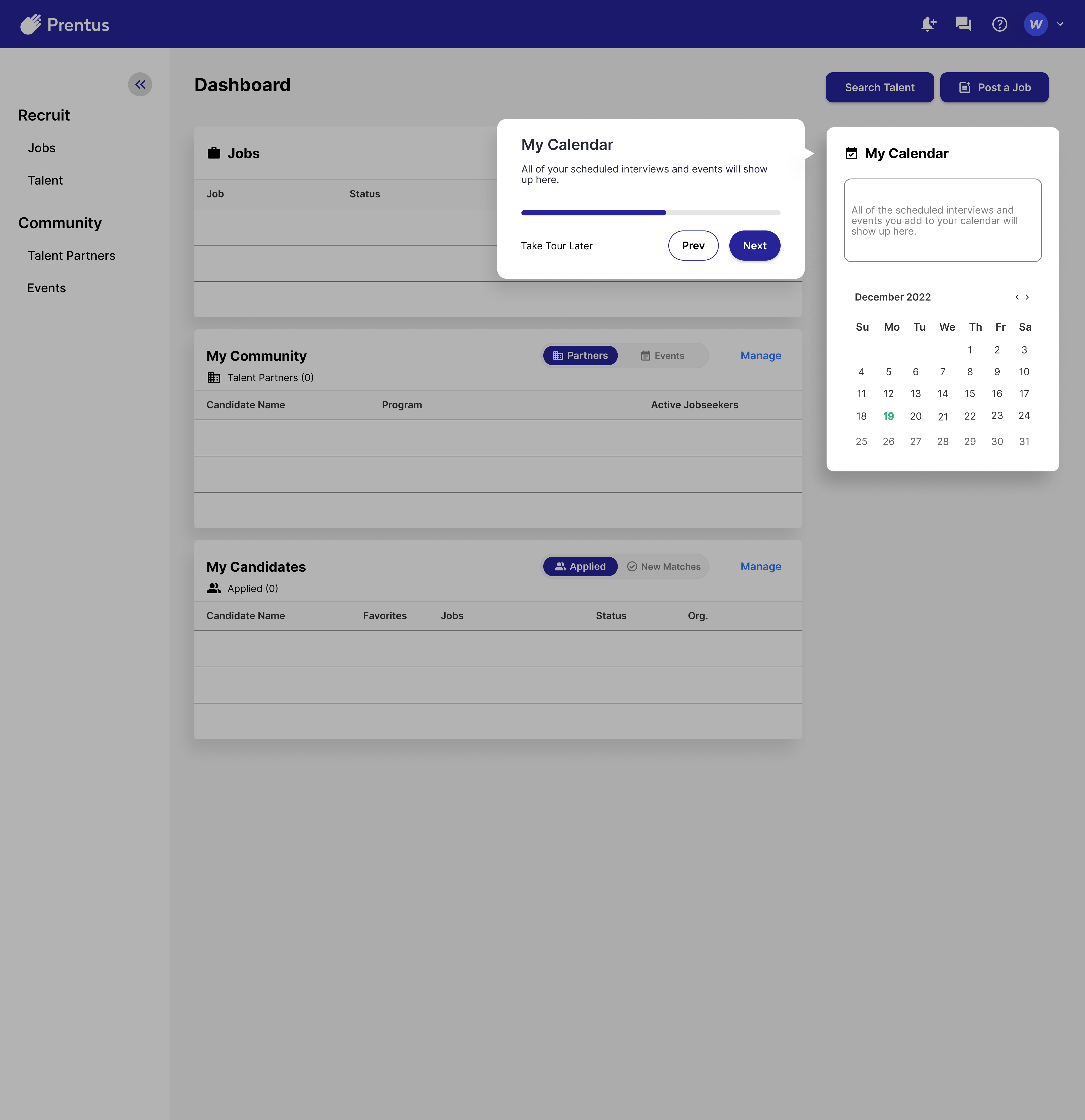
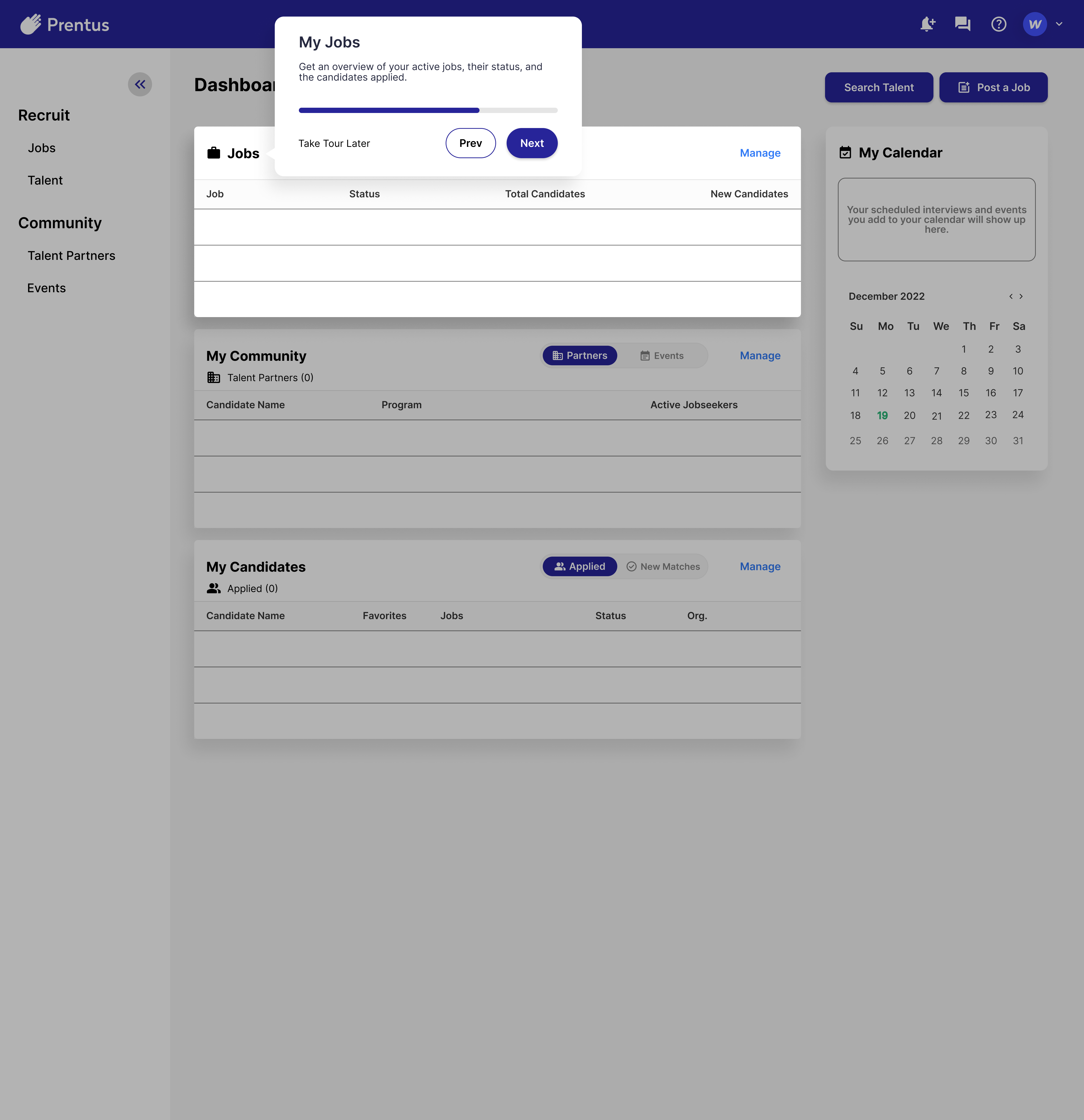
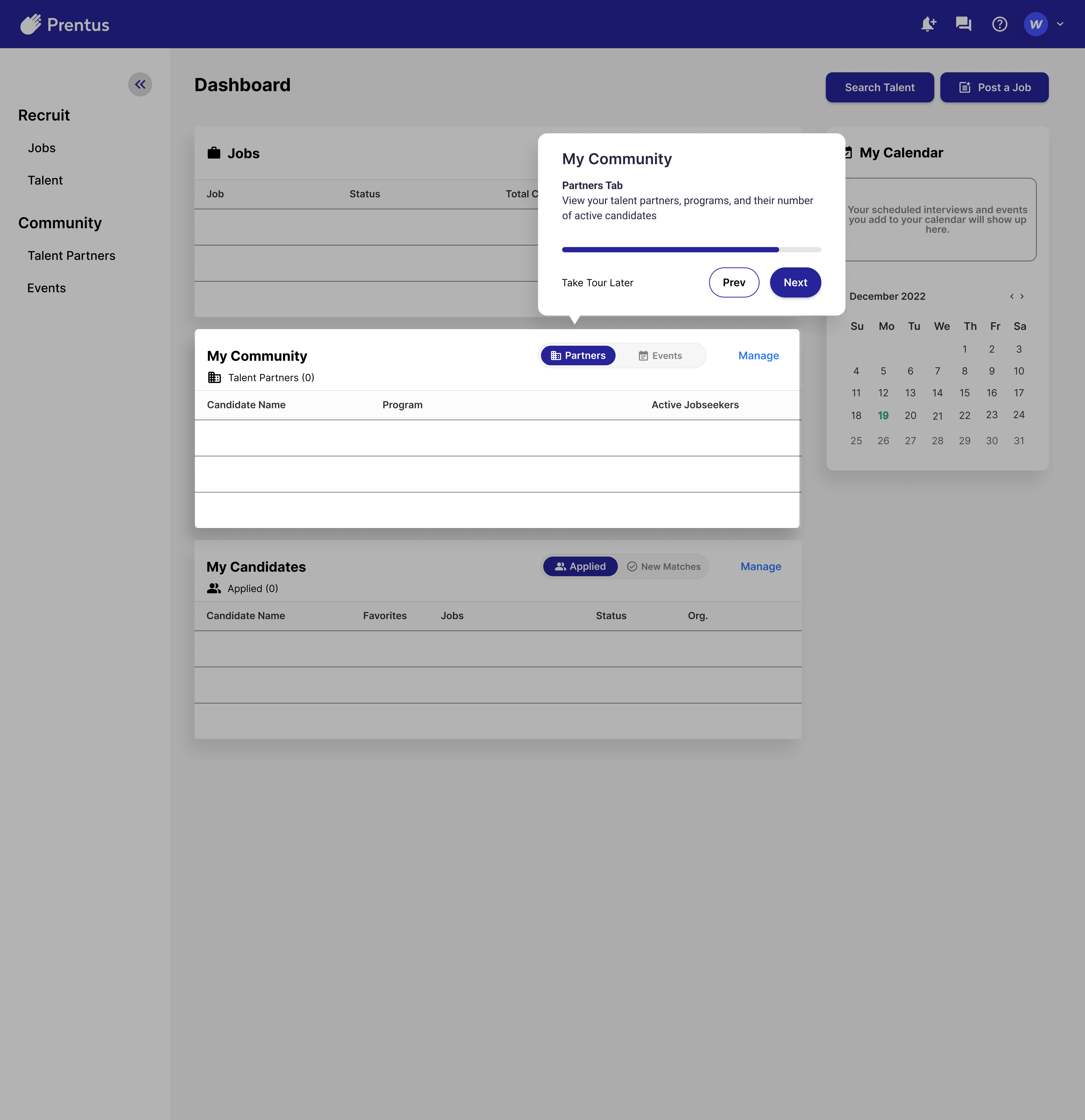
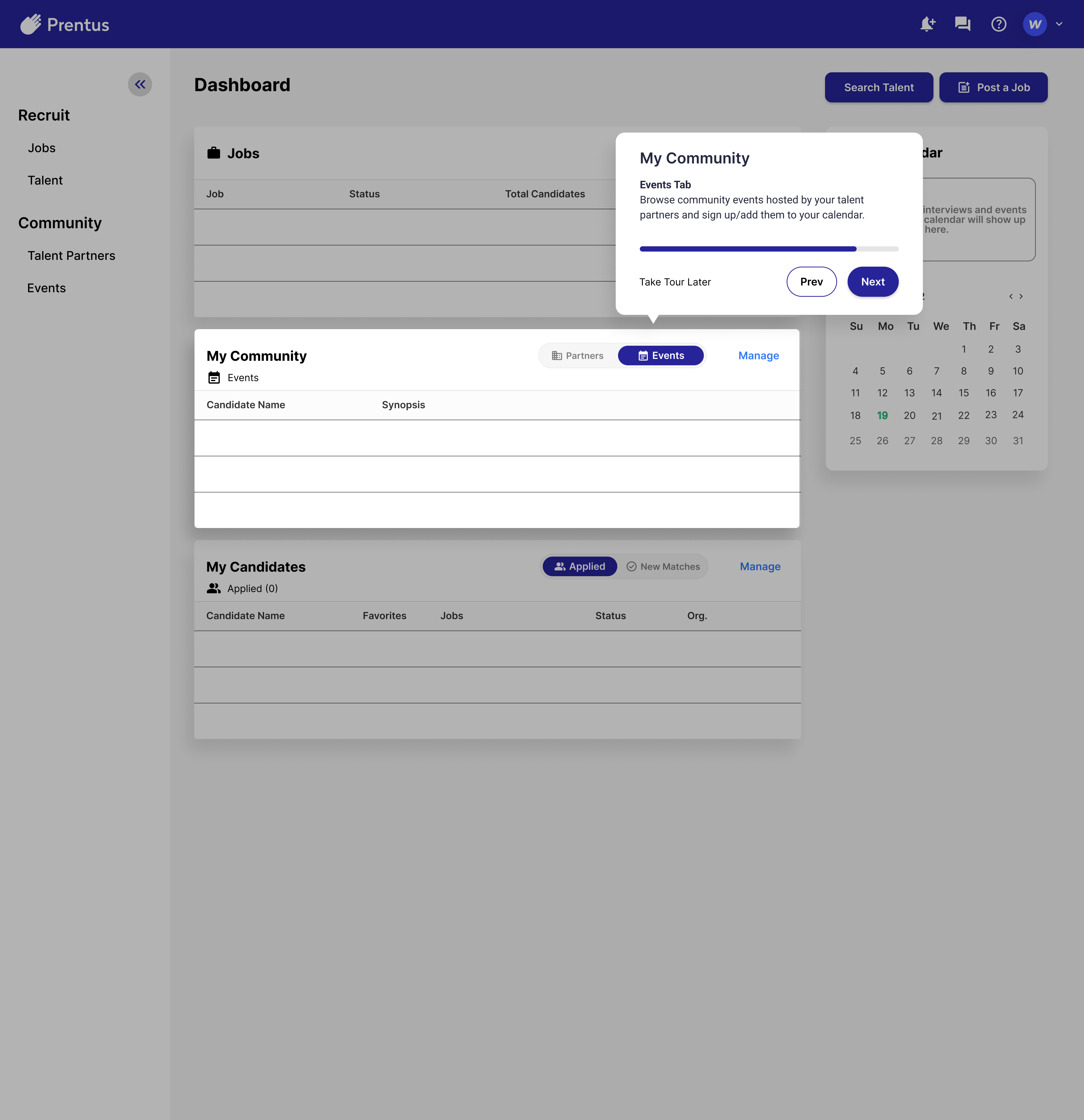
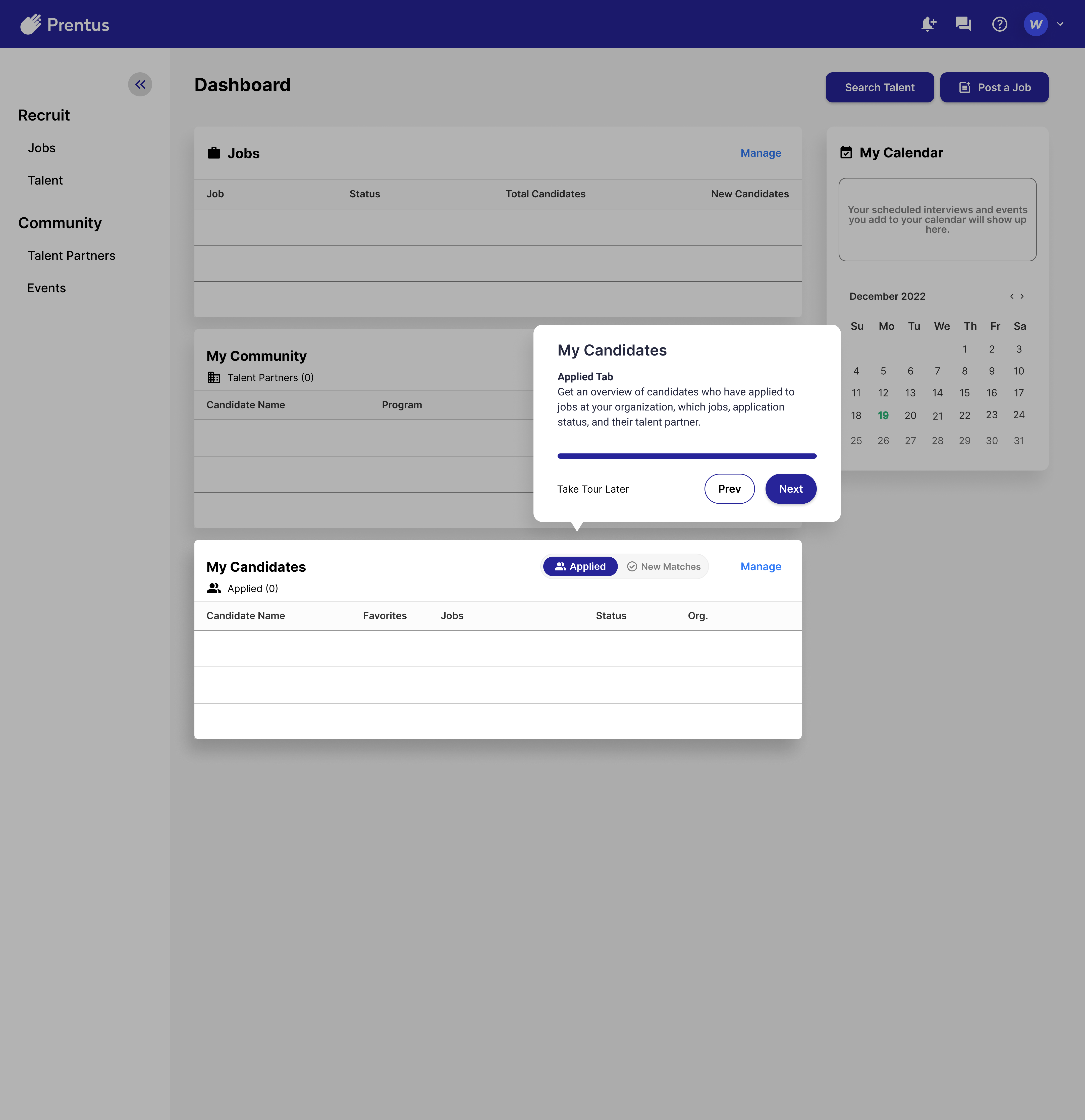
Prototyping
A prototype is a working model of a design that imitates how the finished product will function.
This image shows how our team created one of the Figma prototypes for this project. The blue lines illustrate the connected flow from one element to the next.
Click below to experience the prototypes for both parts of this project:
With our completed prototype, we conducted a second round of usability testing.
Goal: Test our final design.
Rationale: See how our design changes the user experience compared with the first round of usability tests, which focused on the existing Prentus design.
We conducted tests with two user participants using three different tasks (Tasks 1 and 2 are identical to those in round 1 of usability tests.): ○ Task 1: Sign up and create a profile ○ Task 2: Add a talent partner ○ Task 3: Add an event
Both users were successful with all three tasks. This gives us evidence that our design seems more usable than the original design, especially with task 2. It also shows that it is still highly usable with Tasks 1 and 3, after the design changes we made.
Next Steps
Our recommendations for this project’s next steps include:
Development: This project included UX design only and did not include developing the design into live changes on the Prentus site.
Additional usability testing: Due to this project’s constraints, we didn’t perform usability testing with the recommended 5-10 user participants. Data from this larger pool size would support whether our designs are truly more usable.
Videos and/or screen recordings in onboarding: We provided placeholders for these elements in our designs and recommend they be developed and included based on our competitive research findings.
Allowing for video reviews: This feature is becoming more commonplace and would help the Prentus platform stand out from competitors.
Putting new onboarding system in help section or tooltips for later access: This recommendation aligns with multiple usability heuristics, most notably “user control and freedom“. Some users will undoubtedly want to speed up the onboarding and tour process at first, while being able to refer to it at a later time.